IT'S ALL AN ILLUSION

Be honest. It’s not often that you get to talk to a tiler about the Bezold effect, is it? This tiler was putting up some tiles in the bathroom which were of a subtle shade that we had spent some time choosing. Now, up on the wall, they seemed pretty dark.

“Don’t worry” says the tiler, “Grouting makes all the difference.” He didn’t actually use the word ‘Bezold’ but he knew what he was talking about. Once that soft white grout had slipped into the gaps the shade lit up very noticeably.

I dashed for my bookshelves and the tome about optical illusions.  I’ll give neither title nor author of this book since it’s truly slapdash effort.  While doing a bit of digging for this blogpost, for example,  I noticed that the author has lifted whole chunks of text straight out of Wikipedia. (At least I change them around a bit….. ) But the visual illusions in the book are interesting nonetheless.  The Bezold effect, for example, concerns the way in which a colour’s tone is changed by those around it.  Like so. 

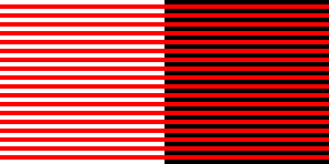
 The white surround makes the red look lighter and the black makes it look darker.  Now this jogged my memory.  My next stop – prompted, I admit, by Wikipedia -was White’s Illusion which is not dissimilar. 

 Here the basic black and white grid has been overlaid by two sets of grey rectangles of the same shade.  Yet the grey between the blacks looks darker than that between the whites.  This is even though, unlike the Bezold effect above, the former has white at each side; and the latter has black on each side.  Curious, eh?

Now this is of some importance to anyone (okay…..me) who is mounting and framing black and white photos.  The bit of my memory that these illusions had jogged was an example in the excellent Larry Bartlett’s Black and White Photographic Printing Workshop (Fountain Press; 1996)*.  Take the two photos below.  Which of the prints do you prefer: the darker or the lighter?

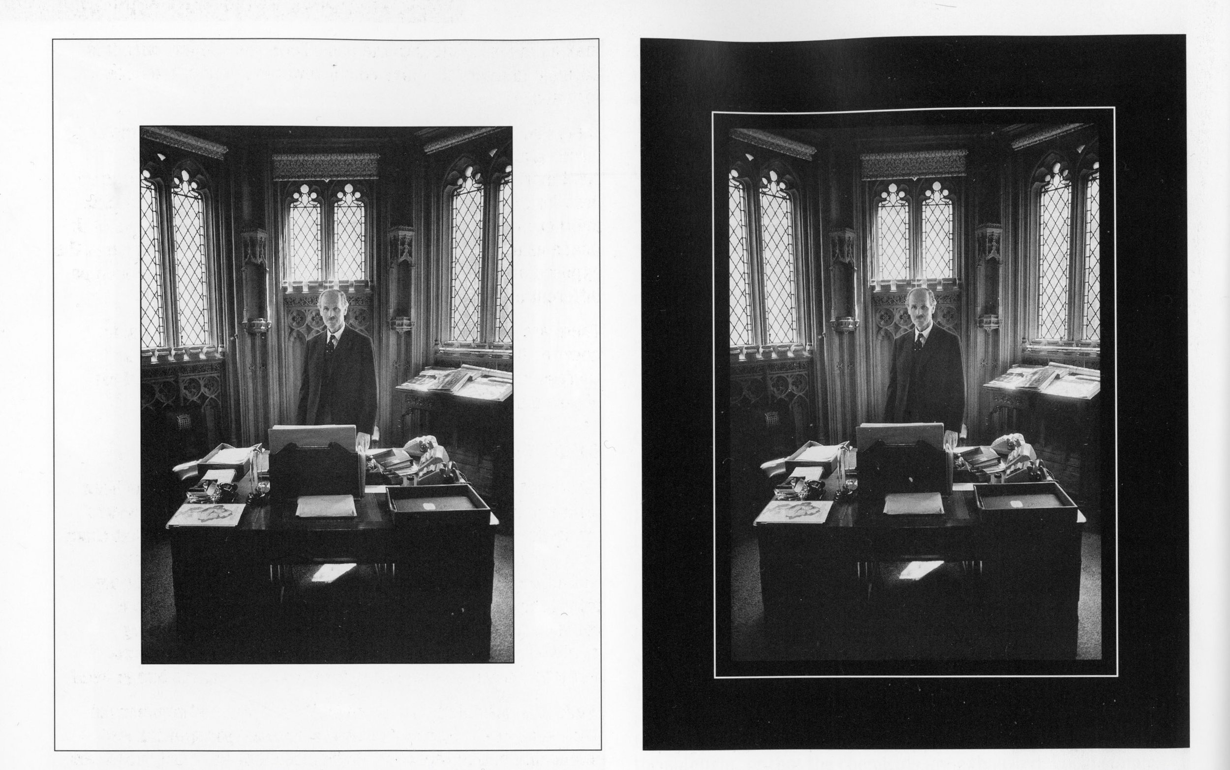
 Okay, you’ve probably guessed that it’s a trick question.  The prints are exactly the same.  The one on the right looks darker than that on the left simply because of the shade of the mount.   It may be that the two different slimline borders may mitigate that effect, I’m not sure.

I will be bearing this in mind in the future.  It has always been my habit to mount my prints on some sort of ivory shade of mountboard because it seems to give the print more light.  Now I know why.  But I had never thought of using a darker mount deliberately to darken the print. I was so inspired by this idea that I went straight to the Photographs page of this blog and converted all my Cow Parsley images to darker mounts. See what you think.


*The original price of this book was £24.95 and I picked it up secondhand for £3.99.  It’s odd that the price of film cameras is increasing everyday and so is that of darkroom kit.  But pukka instructions on how to develop and print properly from the days when there was no alternative are still available at bargain basement prices.  What does that tell us? I have a handful on my bookshelves now and they are a treasure trove of knowledge and experience which I refer to constantly.

ZEN AND THE ART OF PEERING THROUGH A VIEWFINDER

I’ve just come back off a six day Zen retreat – my first for two years since none have been held over the lockdown period.  This one wasn’t my usual Zen group but most such retreats are pretty similar.  There is a lot of sitting meditation, zazen as it is called - but it is the way that these events are set up which is perhaps most important.  There is a timetable of zazen, work periods, meals, some instruction or talks and a little ritual or chanting of some kind.   Once you are into the swing of this there is very little to think about.  Next, you are in silence.  You don’t talk to anyone or otherwise make contact with them – even eye contact if you are going to do it properly.  You don’t bring books to read, laptops or tablets to browse, paper and pen for jotting things down or any other little sidelines.  You put your phone away. There are absolutely no distractions.

When there is absolutely nothing to think about, what happens?  Oddly enough, thinking happens.  At first, in fact, the mind goes into overdrive.  I have been on many of these retreats and the first day is always the same: a bumpy ride.  You might have thought that thoughts were the product of your life’s round but it turns out that they come and go more or less as they please.  The zazen is usually about five or six hours a day so you have plenty of time to contemplate this  dizzy spinning of the mind.  Sometimes a little peace and quiet develops but it always, in my experience, goes away again.  This is what our minds do: they come and go like a lighthouse beam.   So the mind is itself often a distraction in its own right.*

Photography is not generally considered to be one of the Zen arts. Traditionally, that is more the realm of calligraphy,  poetry, brush painting and so on.  However, zen insights can easily be transferred to photographic practice.  On second thoughts, I think maybe we should knock that word ‘easily’ out of the sentence.  Let’s just say that it is possible to transfer them.

When I look through the viewfinder I often find that my mind starts doing its thing again.  “This will make a good photo!” it says and off it goes.  The moment that I allow myself to be distracted from what I see in the viewfinder by this chatter, and to wander away from the moment, I lose whatever clearsightedness  brought me to the scene at that very second.  Sometimes I put the camera down and keep walking.  Sometimes I repeat to myself: “What is this?  What is this?”  Sometimes I am not distracted at all and the photo takes itself.

It was an absolutely beautiful morning as the retreat ended and I took the chance to have a walk up the nearby coast with the Rolleicord.  I like to think that the photos I took will reflect a certain otherworldly serenity but I have a nasty feeling they may look more like desperate attempts to capture ghosts.  It will take me a few weeks to get around to developing and scanning them but I promise to put one or two into a blog post to see whether they amount to anything interesting.  In the meantime, here is a photo which more or less took itself once I had got out of the way.

I took this photo on a very wet afternoon in Bristol last autumn. It’s a streetscene reflected in a giant mirror orb. It was a good exercise in not thinking because the panels broke up the scene so that I could only react in a split second to whatever appeared. The thinking mind can’t cope with that so spontaneity takes over. I guess that it is all about playing, really.

*Mind does tend to get a pretty bad press in the world of Zen so I would like to record here my deep respect for all those mental processes which have contributed to the survival of the human race over the centuries.  After all, you wouldn’t cross a busy road in contemplative mode, would you?

THE UNKNOWN CRAFTSMAN

Yanagi.jpg

Funny how one thing leads to another, isn’t it?  Over the summer I was reading a biography of Joseph Campbell the renowned American mythologist.  Who should turn up in these pages but Daisetz Suzuki, the Buddhist scholar and at his side his secretary, a young woman named Mihoko Okamura.  She seemed an interesting figure so I looked her up and came to the potters Bernard Leach and Shoji Hamada. She helped them to translate essays by Soetsu Yanagi about craftsmanship and the nature of beauty, published under the title The Unknown Craftsman.*  Right up my street: so I found a copy on the net – and a good job I did.  It’s a kind of creative manifesto for the common man and a rare counterbalance to the cult of the Artist Genius.

I have never understood why I seem unable to appreciate the works of high culture that are so venerated.  When I hear a full orchestral symphony I feel only confusion.  When I look at the paintings of the old masters my head spins unpleasantly.  When I try to read the Great Novels my eyelids begin to droop within minutes (Moby Dick, anyone?). I find it all too much, as though I were being pummelled.  That is not to say that I don’t appreciate beauty.  It’s just that I find it hard to perceive it in such works.

If you have ever felt the same then Soetsu Yanagi may be your man. He lived from 1889 to 1961 and seems to have been to some extent the William Morris of Japan, founding the Japanese craft movement and the Japan Folkcraft Museum in Tokyo.**  He was a great and almost lifelong friend of Bernard Leach – whose ideas and style he influenced greatly.

His ideas, and consequently his essays, are deeply immersed in Buddhist notions of beauty.  While he does not deny the genius of the Great Artist he finds the work of such figures to be personality-based and therefore limited – anything signed is suspect.   In Buddhist terms it is dualistic; it is a direct pursuit of beauty and that must therefore include ugliness. Beauty cannot exist without ugliness just as up cannot exist without down.  One of the words he uses to describe this kind of work is “eventful”.

The alternative is the work of the unknown craftsman.  Back in the day when the hand-crafted object was the norm, the craftsman had to work quickly and unselfconsciously.  He was creating objects for use within a tradition: concepts of beauty and ugliness were not in his mind.  In Buddhist terms this is non-dualistic or “eventless”.  One example to which Yanagi refers constantly is that of sixteenth century Korean Ido tea-bowl. 

Kizaemon Ido teabowl, Korea, sixteenth century.

Kizaemon Ido teabowl, Korea, sixteenth century.

Produced on a large-scale in their day and cheap as chips then, these are  uncalculated and straightforward, their beauty lying, says Yanagi, in their very ordinariness.  Many other examples are given in the illustrations which form the first 90 pages of the book. In Yanagi’s words these are objects which are “born and not made”.

It is not easy to transfer these ideas to the modern world (he was writing these essays before and just after the second world war).  Even then machine-made products had taken over in the West and Japan was not so far behind.  The advent of mass production and the profit motive signalled the end of grace and feeling in the production of everyday goods. In his view it is the designer who has inherited this responsibility.  Maybe that accounts for the popularity of shops such as Habitat, Ikea and Muji today whose products seem to have emerged from some similar ethic even though they are all machine-made.

 I know that not everyone gets their rocks off on these kind of ideas.  (When one of my daughters saw me reading this book she rolled her eyes and mimicked falling asleep.  See what I have to contend with?)  When I was studying photographic history I, too, found most theoretical approaches induced a mental state bordering on catatonia.  But for me this book took some previously fuzzy suspicion and really snapped it into focus.  Why do I so like a mass-produced glass bowl in our kitchen which is chipped and scarred and which I can’t even remember buying?  And why have I always hung onto a couple of small wooden boxes that I remember lying around in my grandparents’ house fifty or sixty years ago.  I think they might even be somebody’s school woodwork projects.

English earthenware pitcher, eighteenth century.

English earthenware pitcher, eighteenth century.

Obviously, I try to apply these ideas to photography but it’s not easy.  A photograph is not the result of craft these days and is not in any way the equivalent of these hand-produced objects from the past.  I did however once go to a small photograph exhibition given by a local photo club.  Just at the entrance to this exhibition was a table with photographs made on simple digital cameras by young children at a nearby primary school.  They took my breath away with the directness of their seeing.  The children had clearly made no attempt to produce beautiful photographs as we all had in the main exhibition.  They just pointed the camera at whatever interested them and clicked: “good” and “bad” were of no concern to them.  The results really were on another level.

It’s quite possible for an adult to do this but it takes practice.  You are simply trying to see without responding as you habitually do.  We look and we consider things to be beautiful, or ordinary or unusual or whatever yet there is a space between the looking and the labelling and we can expand that space if we practise.  Here is Yanagi’s advice.

“First, put aside the desire to judge immediately; acquire the habit of just looking. Second do not treat the object as an object for the intellect. Third, just be ready to receive passively, without interposing yourself. If you can void your mind of all intellectualisation, like a clear mirror that simply reflects, all the better. This nonconceptualisation……….. may seem to represent a negative attitude but from it springs the true ability to contact things directly and positively.”

* The Unknown Craftsman: A Japanese Insight Into Beauty.  Soetsu Yanagi. Kodansha Publishing, 1972. I’ve just noticed that Penguin also published “The Beauty Of Everyday Things” by Yanagi in 2019 though I don’t know how much overlap there is between the two.

** There is an interesting longterm project afoot to collect and restore a film archive documenting these years of the Japanese folk craft movement and Leach’s involvement: http://mingeifilm.martygrossfilms.com/

IN PRAISE OF OLDER PHOTOBOOKS

You can pay a lot of money for a book of photographs by even a minor name.  £50 or so for a new one would be quite common and if it’s out of print then even a secondhand copy could be a lot more.  I paid about £50 if I remember rightly for Dave Heath’s   “Multitude, Solitude”  When I had my great book giveaway a couple of years ago I saw it on resale in the charity shop I had given it to for over a £100.  Now it is going on Amazon for £195 used and £378 new. 

So, a while ago, I decided to set myself a limit of £20 in order to bring a little discipline into this whole process.*  And, as ever, that discipline has its rewards.

41kcmh8pvqL._SX362_BO1%2C204%2C203%2C200_.jpg

This book is one of them.  I picked it up for £9 in a secondhand shop before Christmas.  I have no idea who Jenifer Roberts is, or was, and can find out nothing about her on the net.  Published in 1992, in many ways it’s a standard kind of book containing landscapes and portraits from the author’s travels around the world.  They are classical, perhaps even a little out of fashion now but there is nothing wrong with that.  The landscapes can certainly hold their own with the classic ‘Land’ by Fay Godwin which would probably be seen as the benchmark for this kind of work.  Plus she does quote Virgil: “To the spirit of the place and to earth/ the first of the gods….”

What makes the book unusual (apart from the Virgil) is the author’s openness in setting out her general technical approach both to taking the photos in the first place and then to developing and printing them.  And the great lesson is this: the whole process is very, very simple.  That is not to say for a moment that it is easy.  It’s just a great relief in the kaleidoscope of digital imagery tools to have someone set out fundamental rules very clearly.  For example, she says that when you produce your prints there are only two main variables: one is how dark or light you want the print to be, and the other is how much contrast you want.  To be honest, I had never thought of it that simply.  In fact, now I look at the controls in my software, Lightroom, I see that Exposure and Contrast come first.  Unfortunately, they are followed by Highlights, Shadows, Whites, Blacks, Clarity, Vibrance, Saturation, more Highlights, Lights, Darks, Shadows and Point Curve.  And those are just the tonal controls. Like many, I suspect, I have arrived at my own system largely through intuition.

In the darkroom, beyond those two main variables, the author darkens and lightens tones locally in the print – and that is about it in general terms because grain and sharpness have been taken care of in developing the negative.  A tonal change which you can make in a second onscreen now would have taken her a few hours through from execution to dried print in the darkroom.  She writes that It could take her a week or two to perfect a print.

Then, as you go through the book, for each picture she tells you how she how she saw it when she clicked the shutter – which generally means how she judged the exposure and whether or not she used a filter on the lens – and how she enhanced that in the darkroom.  It takes a lot of confidence and a lot of goodwill to be that open.  It’s really helpful.

41fdJDVgoLL._AC_UY218_ML3_.jpg

I also picked up this one, at the same time for £8.50.  It’s a 1979 publication and that ‘2’ in the title suggests that maybe it’s one of a series.  It contains the thoughts of eight photographers about photography in general and their darkroom technique in particular.  Some of them are pretty well known: Lisette Model, Aaron Siskind, Charles Harbutt, Cole Weston.  It’s fascinating – not least because the tone is so even: it’s just a kind of sensible chat.  It reminds me of the Paris Review series of interviews with well-known authors that I used to devour years ago.  You learnt a lot from the references and asides and methods.

This idea, that there are authorities, whom it is worth listening to, is a bit passé these days.  They are probably still there somewhere but everyone is shouting so loud.  The older, cheaper books take you back to a time when voices were not so raised.

“ In order to maintain the rigorous standards of honesty to which this blog aspires I have to confess that I offered a seller on ebay £25 for Charles Harbutt’s “Travelog” for which he was asking £40. He obviously didn’t share my views on rampant consumerism in the photobook market and turned me down.

THOSE CREATIVE JUICES YET AGAIN!

I dunno. You think you’ve got all four corners of the suitcase battened down then you look over your shoulder and you find that one of them has popped up again.

By using The Little Game from The Online Photographer website I managed earlier this year (see posts 1-3 in this series in April- June below) to refocus my general photopractice and to give it a bit more definition.  I decided then that I would stick to a core of four categories: Spirit, Growth and Form, Cityscape, and People in Situ.  In the past couple of weeks, having the summer’s photos to catalogue, I decided that it would be logical to use those four categories to keep things in order.  So thanks to the wonders of software I can keep them both in chronological sets but also in subject categories. 

I renamed Cityscape ‘Les Alentours’ – which is simply the French for ‘surroundings’  or ‘environs’ but I thought it leant an air of Gallic sophistication to the humdrum realities of my photolife.  Seized by this notion I then changed People In Situ and gave it the new title of Personae. ‘Persona’ was originally a mask worn by Greek and Roman actors and came to mean the part or character played in the world so I thought the new title gave a certain, well, gravitas.  ‘Spirit’ I changed to Contemplative to widen it, and Growth and Form I left as it was. 

Then I took each of these four and subdivided them, rigidly policing my tendency to lapse into the abstract.  So, for Les Alentours, I have Bridges, Buildings, Underpasses, Walls and so on.  For Personae I have Framed, In Space, Talking, Thinking and suchlike. Ditto for the others.  From now on every photo I keep will fall into its category and subcategory in this system!  It may well feature more than once but this is the basic grid. 

You might think, as I did, that this would be just a technical matter, a question of attribution.  But in fact, a small miracle occurred as soon as I had done this.  Look at the existential crisis I had fallen into when I wrote one of my first blog posts in February 2017 (below entitled My Jigsaw Puzzle Of Photographs).  I was clearly all over the place.  Yet suddenly this has sorted itself into clear patterns.  For example, I never knew that I took so many photos of urban walls.  But look!

000021-2.jpg
000036-3.jpg
CNV00031.jpg
CNV00099.jpg

I love these Wallscapes.  They seem so personalised – either in their construction or in the layers that have been added over time.  They run all the way from a classical kind of formality to sheer unruliness.  Who did all this (and, in particular, who put that letterbox so high up on the one second from the top? Was it a humane attempt to save the postie’s fingers from the alsatian’s teeth?)

Who did all this? The ghosts of the city, of course!

I feel really buoyed up by this whole process.  You start off with A Little Game and you end up with A Big Discovery.

IT'S IN THE BAG


There’s nothing like a long-distance walk to clear the mind.  And a few years ago I discovered the wonder of getting my main bag transported from night stop to night stop so I didn’t have to shlep it.  So when I suggested to Mrs Barker that this year we should walk St Cuthbert’s Way – a 70-mile hike from Melrose in Scotland to Lindisfarne - she readily agreed since she is not one for carrying any more than is absolutely necessary.

 I had quite separately been coming to the conclusion that I needed to buy a decent camera bag and the prospect of this walk spurred me on.  The non-photo-geek might say -  WHAT?!  You need a special bag – just to carry a camera?  Hello??

In truth you don’t.  You can just throw your camera into any bag.  It will get battered though and you can spend a long time rummaging through everything else in the bag trying to find it.  For a long time I did use a standard rucksack into which I put a camera bag insert – a kind of padded rectangular thing with Velcro dividers which cost me about £10.  I still got fed up after a few years because it was always at the bottom of the bag and it took forever to get the camera out.

When I investigated the market I was surprised to find that there is an infinite number of camera bags available – truly hundreds of makes and models. If you look hard enough you can even pay over a thousand pounds for one. They are all essentially the same, some bigger and some smaller.  The smaller ones are basically just, well, bags; and the bigger ones usually have a separate entrance for your camera kit. It is the job of marketing departments to persuade you that they are all different and theirs is best.  What happens to all those billions of bags which are never bought?  Presumably they end up in some sort of camera bag graveyard eternally condemned to hang empty from the shoulder of an uncaring Destiny.

You can get the odd bargain on ebay or gumtree or wherever but you can also get a minger.  It is worth trying other options and for photography there are secondhand kit sites like Ffordes Photographic to check.  I got a decent one there for £70 (less than half the new price) and it really is in as new condition.

Taking the beautiful Hasselblad in the bag may have been a mistake.  It was partly for the sheer thrill of having it with me but it’s a thrill which weighs nearly 4lbs and at the end of a 15+ mile day up hill and down dale that is a significant weight.  On two days it was raining so heavily that I hardly dared  get it out of the bag. 

My plan was to shoot a tree a day. I’ve always found trees to be a difficult photographic subject so I thought it would be a good discipline. I shot one roll of film in the end – twelve frames – which in my opinion is quite enough for a six day holiday.  There are six tree shots on it but I wouldn’t be able to remember what the other ones were without looking at the notes I took. This is the excitement of film photography: it is a longer process which seems to work partly at a subconscious level. By the time you have developed and scanned/printed your film the images are an amalgam of memory, imagination and intention. With digital there is an immediacy which has a very different effect.

Anyway. Trees and fields are all well and good but I’m a fan of a good powerline too.  Like this.

img022.jpg

Magnificent beast, eh?  ( If you agree then try the Pylon Of The Month website or join the Pylon Appreciation Society We are perhaps not a very happy UK at the moment, but surely there is something fundamentally hopeful about a country where such enthusiasms exist?)


FIRE IN THE ENGINE ROOM

 When IT Goes AWOL.

Choice can easily result in paralysis.  Then again, paralysis can be good.

My nine-year old laptop was slowing down to snail’s pace.  I had done lavish research before I bought it and it was, at the time, a good one:  Intel i5, 500gb of hard drive and so on.  I felt I was going to have to buy a new one but every time I went anywhere near a shop the choice seemed overwhelming.  And it is a curious thing that whenever you replace a piece of kit these days – white goods, electronics, transport, whatever – what you get is never quite as good as what you had. 

Anyway, I ruled out anything from Apple and any of the comparable Microsoft machines on the grounds of cost and overengineering.  They seemed to be way more than I needed.  A modern equivalent of what I have got seemed to come in at £600+.  Still a lot of money – and particularly so since the hard drive capacity on these newer machines is often miniscule: presumably you are meant to use the cloud for storage these days.  I was paralysed into indecision.

Perhaps to create the impression in my own head that I was doing something I decided to get the current one serviced.  The guy I use for this suggested that I think about a solid state hard drive.  I thought these were external when used as upgrades but apparently not, so I decided to go for that option.  In the end I got an SSD, a service and my old hard drive back for external use all for £63!  Not bad at all and a good example of positive procrastination. As a result the laptop is a lot quicker and cooler to run and is probably now better than new.  

Disaster struck all the same and my misdemeanours came back to haunt me because my chosen photo software – Lightroom – stopped working.  I knew why.  It was a copy I had had installed when I was doing a photography course and was not strictly speaking legit. after the end of the studies.  Installing the new hard drive had disabled it and I didn’t have the code to reboot it.

Not only that.  Last year, Adobe decided to discontinue one-off open-ended licenses.  Now you have to subscribe for £10 a month - and for way more functionality than certainly I need.  They are trying to get you hooked, of course.  But I only ever do very basic processing of my photos.  (It’s meant to be photography and not digital image-making, after all.)  This was bad news.   The last copies of Lightroom 6 (the final one-off version) on the market seemed to have been hoovered up.  Undeterred, I set up an ebay alert and sat back.

It’s fashionable to diss Ebay but I find it amazing: an eternal circuit of goods and money in pursuit of one another. It’s a kind of perpetual motion. Surely someone will one day produce some sort of exhibition or photobook of ebay product photographs? It’s like the world atomised.

Anyway, back at the plot, I missed two chances of Lightroom 6 because they were snapped up within an hour or two of appearing on the site (An hour or two!  For obsolescent software!)  But finally I got one.  Even as I write, I am waiting for the DVD to slide through the letterbox.

I was well chuffed.  The episode, I mused, seemed to offer two lessons.  Firstly, it’s always worth exploring options before buying a replacement: even in the dark undergrowth of digital technology there may be a cheaper way lurking in the brushwood.  And secondly the corporate titans may not have got it entirely sewn up: you just need to look around a bit.  It’s always good to beat the system.  If the DVD solution hadn’t worked I was willing to go for a smaller, less mainstream product.  They wouldn’t get me!

I put these subversive thoughts to a group of photofriends recently.  I saw myself, red flag aloft, on the revolutionary train to an open source future (something like Tom Courtenay as Strelnikov in Doctor Zhivago). Anarchic slogans raced through my mind.

BENEATH THE PAVING STONES – THE BEACH! STICK IT TO THE MAN!  BETTER TO DIE STANDING THAN LIVE ON YOUR KNEES!  HAVE FEWER CHILDREN, BREED MORE PIGS! (Honestly. It’s a Chinese one.)

My friends weren’t convinced.  Peter, they said, Peter. Calm down. It’s only a tenner a month.  Just pay up and stop obsessing, eh?

Oh, well.  Fewer slogans, more colour - maybe that’s what we need. The guys below might agree.

Qingdao, China 2014 © PMB

Qingdao, China 2014 © PMB

THE BMW PRINCIPLE

 When Good Enough Is Best

Like this one, only black.

Like this one, only black.

Once, after I had been living abroad for a while, I came back to this country with some money in my pocket.  Since I was a keen motorcyclist I decided to spend some of it on the finest motorcycle that money could, at that time, buy: a 1000cc BMW.  I figured that it was probably the only time in my life that I would be able to afford to do such a thing ( – which regrettably enough turned out to be quite correct).  So I bought this magnificent machine and rode off into the sunset expecting motorcycling heaven.

But: the greater the expectation, the greater the potential disappointment.  No matter what machine you are on, the rain is still just as wet, traffic is just as heavy, and many routes are just as tedious. So it turned out to be: it took me and that machine quite a long time to overcome the blandishments of the BMW marketing department (and of my own colourful imagination).  Once I had done so things were fine.  I owned it for about 25 years and Mrs Barker and I had many fine adventures on it.

The lesson I drew from the episode is that, unless you know exactly what you are doing (and who ever does?) it is never a good move to buy the brightest and the best of any product line.  Mid-range, or second-hand, or doing without, or reframing the issue are all potential options.  What you have to ask yourself is not: is this the best?  The better question to ask for both mental and financial equilibrium should be: is this good enough?  You really don’t need any more than that. This is a principle that I most recently put into operation with a bit of photokit:  a scanner.

Since I have now been shooting film almost entirely for eighteen months or so I decided it would be a good idea to buy a scanner.  Locally around Manchester you pay somewhere between £20-£27 for developing and scanning one roll of 35mm film (36 shots) or one roll of 120 medium format (12 shots).  So that gets expensive.  There again, so does buying a scanner if you are not careful.

Secondhand is a possibility when buying electronic equipment but personally I hesitate over that option: you never quite know what you are getting.  New top of the range scanners cost tens of thousands of pounds but they are for professional use.  For the non-professional prices start at about £50 or so and top out somewhere over £1000.  I did my research on the net.  A Canon 1900 (£190) was neck and neck with an Epson V600 (£260) for quality. But – the top of the range Epsons (£550 +) were, according to various reviews, EVEN BETTER!  This is when I decided to employ my BMW principle.  I went for the Canon.  That turned out to be out of stock everywhere so I went for the Epson V600 from First Call Photographic whom I have used in the past and found reliable. 

The cognoscenti are a bit sniffy about the quality of scans on a flatbed scanner.  I tried to keep an open mind. Here is a comparison between the same negative scanned by my local lab and then scanned on the Epson.  I’ve tried to keep roughly the same settings in Lightroom but they can’t be exactly the same because the input from the two scans don’t match one another exactly.

© PMB. From my last visit to Paris: what used to be the Printemps store and now being redeveloped. Scanned at the lab.

© PMB. From my last visit to Paris: what used to be the Printemps store and now being redeveloped. Scanned at the lab.

Scanned on the Epson V600

Scanned on the Epson V600

 There doesn’t seem to be a lot in it.  The bottom right quarter on the lab scan looks a bit sharper but the backs of the mannequins at the top seem to have slightly more tonal range on the Epson scan.  This is a first attempt.  If I have understood the scanning process correctly you have an extra step with extra opportunities when you scan the image yourself.  This is that when the negative is first scanned and you preview it you can adjust it and are given a histogram to do so  – which shows the full tonal range of the proposed scan.  When you employ a lab you simply have to take whatever tonal settings they give you.  I think that’s right, anyway.

I could have gone for the more expensive scanner for double the price – but wouldn’t I just have got the BMW effect?  My conclusion? This is good enough.