How Big Should A Photo Be?
Two recent exhibitions brought out my inner Glenda Slagg recently. (Glenda Slagg is the legendary Private Eye spoof columnist who invariably expresses wildly conflicting opinions in one article and always in gloriously demotic journalese – typically “Doncha just love….?” or “Doncha just hate….?”)

King of Siam Mongkut of Siam Presenting Lenten Robes at Wat Pho Temple, Friday 13th October, 1865. (John Thomson, © Wellcome Foundation.)
First up was Siam Through The Lens Of John Thomson* at Leicester’s New Walk Gallery. John Thomson was a Scottish photographer who travelled and photographed widely in the Far East and China before returning to this country to document the social condition of the urban poor. His work is often cited as early photojournalism. His images of China and the Far East have been digitised and enlarged and are now a travelling exhibition. In Leicester only the photos from Siam and a few from Cambodia were on show – about 45 in all.
Thomson used the wet collodion process to produce his photographs and these gave glass negatives which were eight inches by ten inches. They would then be contact printed (ie not enlarged) and in his time were mainly reproduced in books with prose descriptions of his travels. So he was producing book-size prints.
The digitisation in 2009 at high resolution made it possible to enlarge the images to many times their original size. (I must start taking a tape measure with me to these exhibitions – I had to estimate but some of these were well up to four or five feet on their long edge.) The exhibition notes said that this gave greater detail, which of course it does. But you could give greater detail by enlarging small crops, too. The problem with enlarging the whole print is that you tend to lose its overall effect because you can’t take it in as one composition. (The photo above is a good example. Details of, say, the palanquin might be best seen in a small separate crop.)
It also gives mounting problems. These images had been printed onto foamboard which was then framed in white frames under glass with spacers to deepen the framing. This seems a bit pointless when the image is so big: the frame can’t do the job of isolating it. Add in highly academic wall notes and what you had in fact was a very interesting ethnographic exhibition which largely excluded any true photographic excitement. In Glenda terms, I came away thinking: “Big photos, eh? Don’t ya just hate’em?”

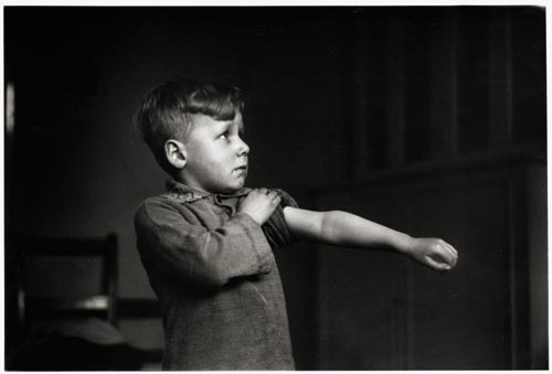
Von, the Sheffield Star newspaper seller, at BSC River Don works, Sheffield. (Martin Jenkinson, 1982)
I hopped off the return train to Manchester at Sheffield to catch the Martin Jenkinson exhibition ”Who We Are” at Weston Park Museum in Sheffield. Martin Jenkinson was a Sheffield-based press and trade union photographer whose subject was daily life in the city and around but who also recorded the politics of protest towards the end of the twentieth century. There were ninety or so mostly black and white images around A4 size classically mounted and then framed in black. They are a bit of a walk down memory lane for someone of my age and I found myself particularly drawn to the quieter images (such as the newspaper seller to the right) which seem to draw out the grandeur of the local and specific when the political action has moved on. There were also plenty of objects from the photographer’s life: seventy-odd press passes, teeshirts, contact sheets, notebooks, protest badges and so on. It all helps to bring out the person behind the images.
But I did find myself peering a bit at the photographs. They needed to be, well, a bit bigger, I thought. Or as Glenda might say: “Small photos, eh? Don’t ya just hate’em?” The best known one, of the miner inspecting police lines during the pit strike of the eighties, was printed more like A2 size and came off a lot better for it. The smaller print has its place but possibly not in modern photojournalism exhibitions.
All in all, though, it was A Grand Day Out: Spring in the air and plenty of sunshine; a fine train journey across the Peak District; two fine exhibitions; and a jolly good picnic in the park. Does life have more to offer?
*The exhibition seems to be divided into two parts: the China imaages and the Siam images. The Leicester exhbition has now ended but you can keep up with future venues here