THE INTREPID ENLARGER

Well.  I’ve been and gone and done it.  Whether it was a wise thing or not only time will tell.

Regular readers of this blog may remember that it is a longstanding aim of mine to expose, develop, wet print, mount and frame a photograph.  Hanging on the walls here at Barker Towers are several examples of my work but they all have missed out one crucial stage: the traditional darkroom printing with water, chemicals, potions and other dark brews.  They have all been digitally printed.  I have always shied away from the darkroom for reasons that, to be  honest, hint at a certain lack of moral fibre.  The whole thing seemed, well, just a bit too complicated:  too much kit, too expensive, no darkroom space, takes forever and so on.

The central piece of kit in your darkroom is the enlarger – which fires light through  the negative and onto a photosensitive sheet which you then douse in developer and fixer and, hey presto, you have a photograph.  There are many secondhand enlargers on ebay and other sites but I know nothing about them and would probably be throwing my money away.  Then one day, somewhere, I noticed that a firm was seeking crowdfunding for a new design of enlarger which would apparently knock the socks off everything which had gone before.  I had vaguely heard of the firm, The Intrepid Camera Company. .  They are best known for making large-format cameras and so are in the business of rethinking traditional photographic kit design. It must have been an impulse, but I decided to sign up for their proposed enlarger.  In a curious way I think that it was a subconscious delaying tactic.  I reckoned it would take them months to fund and build and manufacture it so I would be safe for quite a while from the promptings of my inner Ansel Adams.

But the day of reckoning always comes, Intrepid proved to be as good as its word, and a box arrived shortly before Christmas.  I left it where it was for a few days and then found a quiet moment to have a look at the contents.

Enlarger, control box and negative holders. Those negative holders are a thing of sublime metallic beauty compared to the flimsy plastic ones that came with my scanner. Photo © Intrepid Camera Company.

First things first.  It looks beautifully made, with some bits of it fashioned from, yes, real metal and others from futuristically light materials the nature of which I can only guess at. Being a man of a certain age I would have greatly appreciated an exploded diagram and some basic written instructions but I think I have to accept that these days instructions are what you find on the net and not what you get in the box.  There is indeed a little leaflet included about the control box, but that’s your lot.  It is, as they promised, light, compact, packs down small and leaves me with no excuses whatsoever.

All I can now do is rely on my inner slacker.  (He lives next door to my inner Ansel Adams and believe me those two are bad neighbours.)  I need to buy some basic bits of kit: a lens for the enlarger, a focus finder, some trays and chemicals and so on.  That should take me ages.  Then I am going to have to knock up some blackout curtains for the bathroom.  We’re talking months here.  But I am going to make a public commitment. By the end of this year-ish there will be hanging on a wall of this room a darkroom print that I have shot, developed, wet printed, mounted and framed myself.  Yes, I’m looking forward to it but as in all human affairs we must remember:  it’s about the direction and not the goal.

The darkroom set-up, only not dark. Obviously. Photo © The Intrepid Camera Company.

In order to maintain the high standards of artistic integrity to which this blog aspires I have to admit a little shamefacedly that I have written to Intrepid and asked for permission to use the two photos above but I haven’t yet received a reply. I am sure they’re busy people though and I may not be their number one priority so for the moment I am counting on their goodwill……

WALTER SICKERT AT THE WALKER ART GALLERY, LIVERPOOL

I always mix up Sickert, Whistler and Singer Sargent.  Is it the period, the styles, the two-syllable names or what?  I’ve no idea, but in an attempt to sort myself out I went along to the current Walter Sickert exhibition at the Walker Art Gallery in Liverpool.

Five stars from The Telegraph.  “The Walker’s terrific exhibition goes to the jugular of Sickert's tense and stressful art” roars the Guardian.  You can’t blame the gallery for publicising good reviews but it does seem to raise the stakes for a casual viewer like me.

It is a good exhibition too.  It fills four or five gallery rooms and there must be fifty or so works on display – perhaps more, I didn’t count - along with background material and historical and biographical detail.  It took me about 90 minutes to get around the whole thing.  The curation is mercifully free of the current tendency to tell you what to think but supplies facts and ideas which help you get to grips with what you are looking at.  And I achieved my purpose because I now have a clearer impression of Sickert’s life and work. 

I found the paintings very sombre – even when depicting supposedly lighthearted subjects such as music hall scenes.  The colours are muted, details indistinct, outlines often unclear and I found myself peering quite often.  It was a little like looking at underexposed photographs.  At one point he was commissioned to paint six views of Dieppe for display in a hotel in the town.  All six were rejected.  Here is one above right.

 You can see why it didn’t make the cut, I think.  A hotel owner would be wanting to promote his town but this is a dark picture which hardly entices visitors.  The others were similar.  What was Walter thinking of?

 So you wouldn’t really be looking to Sickert to cheer you up, I think. And I have to admit that I find oil painting sometimes to be a little heavy going, almost ponderous.   My eye seems reluctant to look. Those great big ornate, gilded frames don’t help either.  Yet I love the sketches that precede the works.  I could look at them all day. 

Here is a sketch and then the final painting. 

Baccarat - The Fur Cape. 1920.

I find the sketch fresh and light.  It leaves me speculating in a way that the painting does not.   It’s like radio to television.

Having finished with the exhibition I wandered off to look around the gallery and found a roomful of British art mostly from the first half of the 20th century.  It was fantastic.  I felt that I was walking on air.   Apart from Lowery and Paul Nash I had never heard of the artists shown there: painters, sculptors, ceramicists. Perhaps that absence of expectation is important.  You just wander in and there it is. There was even a Rodin.  I am not sure what he was doing in a room devoted to British art but I could have walked around that sculpture all afternoon watching the light play on it.  The room really lifted me up.

WAITING FOR THE MIRACLE (2)

Taken with a Rolleicord Vb on Ilford FP4 developed in Ilford ID-11

I had spotted this group on the Great Orme in Llandudno and thought it might arrange itself into something if I paid attention.  But I had also spotted out of the corner of my eye a fellow enthusiast edging towards me.  Edging towards me, I imagined, because he had spotted the camera that I had hanging off my shoulder - a 1960s Rolleicord.  He himself was carrying a modern digital camera with a very long lens.  I had a feeling that somehow I was going to be tested.

I kept my eye on the swirling kaleidoscope of figures  at the summit but it was only as the group on the right of the photograph above sidled helpfully into the frame and then the young woman by the trig point raised her arms that I felt the miracle had happened.  I took one shot, just in time.

“Are they as great as everyone says?” he asked, beside me a moment later and nodding at my camera.

I felt this boxed me in a tad.  If I said yes it was, then I would be setting myself up to justify that; and if I said ‘no’ then the obvious question was ‘why do you bother then?’  The only thing to do was to tug the exchange round in a different direction.

“Look,” I said, pushing the camera towards him “the image is reversed in the viewfinder.”  I’d have to admit that there might have been an element of majesty in that response, because everyone who is up to snuff knows the image is reversed in these cameras.

We proceeded to push the conversational pieces around the board but it wasn’t a very interesting exchange.  The territory of photography is so vast that you often stumble across tribes that you only vaguely knew existed.  You  speak their language only brokenly and they seem to have no idea of yours.  His interest was digital night sky photography.  I’m afraid I can’t even identify the North Star.  Ostensibly, capturing digital images of the moving heavens is the same activity as snapping shifting groups of figures on black and white film but in practice there isn’t that much in common.

After a few desultory minutes we tacitly agreed on a kind of amicable no-score conversational draw and he continued on his way.  I turned back to the scene I had photographed to find it had disappeared into the ether and this one frame is the only evidence that it ever existed.

(For Waiting For The Miracle (1) see May’s blogposts below.)

A LITTLE AGITATION

Regular readers of this  blog will know that I have been teaching myself the dark art of film development for a couple of years now.  For me, it turns photography into a craft rather than a digital miracle.

A few months ago I developed a medium format film and came up with this.

 My shot of the old Menai Bridge over to Anglesey has a fault – as if some sort of heavy rain were falling across the image.  Every frame in the roll was the same.  I sort of assumed it was my developing technique since all kinds of things can go wrong: old developer, wrong dilution, wrong quantities of chemicals and so on and so on.  Nonetheless, I contacted the film manufacturers Ilford who to their great credit, having checked the batch number, told me that it was a manufacturing fault and sent me some free film.  Nice of them, of course, but it’s a good job I hadn’t been photographing a Royal Wedding for Vogue, eh?

Fast forward to a few weeks ago.  I pulled another film out of the developing tank and found this. 

 Down the righthand side, as you can see, is a honeycomb strip of bubbly summats spoiling this otherwise winsome shot of Mrs B. contemplating the meaning of life on our recent romantic mini-break on the coast of North Wales.  All frames were the same, thus spoiling my first theory that someone had lit a heavy bonfire to my right as I shot. Ever hopeful, I contacted Ilford who didn’t put their hand up this time but made the polite suggestion that I might be over agitating.  ‘Agitation’ in the darkroom refers to the process of turning the development tank (which is about the size of a pint pot) over regularly so that the developing solution is evenly spread.  And it is a matter which causes not a little discussion in our small community: speed, direction, frequency and their consequences (too much contrast, not enough contrast, shadow detail, highlight tone) are all the subject of detailed scrutiny and strong opinion.

Casting my mind back I realised that there had indeed been some foaming of the developer and concluded that was almost certainly the cause: the film sits on its side in the tank and so when the developer foams the top edge of the film doesn’t get the full treatment. Oddly two other films which I developed after this one were unaffected.  From somewhere – I can’t recall where now – I had got the idea that a ten-second agitation requires ten turns of the tank.  In fact, it seems that is way too much and that four or five is adequate.

It’s frustrating but how else do you learn a craft other than by practice?   


POWER TO THE PEOPLE

 Back in the day, the Central Electricity Generating Board used to have adverts in magazines showing a pristine landscape stretching for miles.  The accompanying text asked you to admire the electricity distribution system.  You couldn’t see it of course: it was underground.  All those ugly pylons had been demolished.  It went without saying that this was a great improvement.

“Like whips of anger/With lightning's danger/There runs the quick perspective of the future” wrote Stephen Spender in a rather fevered 1930s poem about their effect on the elysian English landscape.  Then there’s Cecil Day-Lewis: “ascetic pylons pass…… charged to deal death” is his contribution.  So they’ve never gone down well with the pastoralists: too big, too modern, too industrial, too intrusive.

I’m a bit of a fan myself, though.  I spent a good part of lockdown in photographic pursuit of these magnificent beasts and you can see some of the results in the collection ‘Circuit’ which I have posted on the Photographs page of this website.  One that features there is this 275kv line just beside South Manchester substation.  I see an almost calligraphic precision in its structure, as though I were looking at a gigantic ideogram.

 You could see them as supporting the electricity lines that stretch between them; or you could see the lines as joining the pylons together so they become one massive structure. 

 It’s the way that the lines hang motionless from those horizontals while the electromagnetic waves hurtle through them at something close to the speed of light – 300 million metres a second.  300 million metres a second.   Mostly you can only imagine the immense power that they are carrying but when you stand underneath them in damp weather you hear an insidious crackle and pop.  That is water droplets speeding up the electrical breakdown of the air, and it gives you an almost physical connection to the immense charge above you.   As they near their destination the pylons get smaller, the voltage steps down and down from 400kv through substation and substation to 275kv;  then 132kv and down again to 33kv and 11kv then into the ground where it speeds into your living room, at 240v to power up your lights, your phone and your TV.

I am not alone in my enthusiasm, by the way.  The very wonderful  Pylon Appreciation Society  will tell you everything you need to know about pylons and perhaps more.  And Pylon of the Month – quite separate from the PAS – will give you a magnificent monthly fix.

I was out walking recently and came across what looked like some pretty heavy duty maintenance work to a line.  I fell into conversation with the work crew and asked about that cable you can see right at the top of the pylon below.  Every pylon has one and they intrigue me.  What I suspected turns out to be correct.  It’s an earth line.  Yes, even these mighty beasts are earthed.  So if one ever did fall on top of you its weight might kill you but at least you wouldn’t be electrocuted.

 We all know that our household appliances must be earthed but to see this basic principle applied at the macrolevel comes as a bit of a surprise.  It all comes down to the circuit: the mutual compulsion of plus and minus which powers up the whole caboodle - the return to earth. Negative just cannot live without positive.  The electron must find its proton.  Then there is balance and all is well with the world.  It is exactly the same balance which is holding together every object around you and, indeed, your own body.

 It’s not really an electricity distribution system at all – it’s a gigantic metaphor.

A BIT OF A BLIND SPOT

I really love street art but you have to be a bit careful if you’re flashing a camera around the artists because what they do – unless they have some kind of permission - is not generally legal.  So they are a bit sensitive.  This guy was happy enough to be photographed though when I stumbled upon him finishing off a major mural this summer. 

I’d been chatting to another street artist who was a bit more old-school  a few weeks earlier.  When the question of legality came up he shifted a bit from one foot to the other.  “It’s not entirely, er, legal….” he said.  He paused.  “….well, it’s a bit of a blind spot….”  Then he changed the subject entirely.  “……I use old emulsion and brushes and roller myself so it takes that bit longer …”

I had to smile. 

WHEN FOOTBALL WAS FOOTBALL

WHEN FOOTBALL WAS FOOTBALL

Sefton Samuels is a distinguished, Manchester-based photographer with a long career and many excellent photos under his belt, as you can see on his website. The last two photo exhibitions at the National Football Museum were excellent (see my review of its Pele exhibition in February 2018 below) so I had high hopes of this one - When Football Was Football* - featuring his work. Unfortunately, it doesn’t really do the photographer justice.

When Football Was Football captures a long-ball world of 3pm Saturday kick-offs, Bovril, affordable tickets, packed terraces and sideways northern drizzle……Samuels shot a bygone era that’s a world away from dreaded prawn sandwiches, £100m players and proposals for a superleague.”   So says the Museum in its blurb but that is a bit of a lazy pitch and it comes a bit too close to parody for my taste.

What you actually get is thirty-odd largely undistinguished photos on panels in the entrance area to the museum.  The curatorial effort is minimal and relies mainly on anecdotes and generalities.    To my eye,  what emerges mainly from the exhibition is that football in the 20th century was mainly a working-man’s sport; that players and managers were more accessible then than they are now; and that photographic style has changed the game’s image out of all recognition.

Take this photo, for example.  (I do rather like this one, actually).

  It’s a 1948 image which shows 19 of the 22 players on the pitch plus the referee.  Okay, it’s shot from the crowd, but you just don’t get that style of shot anymore.  It shows a team game, devoid of any real drama and with individual players largely unidentifiable.   In contrast, the modern footballing image, thanks to powerful lenses and digital capture, is a close-up of a dramatic moment featuring no more than one or two players.   The team game has gone and the heroic moment has taken its place.  It’s not the game that’s changed, it’s the portrayal of it. Technology creates truth: now it’s The Beautiful Game, then it was apparently all horizontal drizzle and packed terraces.

Footnote: I just thought that I would pop in the two images below. First is a Sefton Samuels shot of children playing football. I immediately thought it looked just like an L S Lowry painting (as did the photographer, apparently). So I went looking for which one and came up with Lowry’s painting ‘The Cricket Match.’ Am I right or am I right?

* “When Football Was Football”: The Photography of Sefton Samuels continues at the National Football Museum in Manchester until 31 December.

AN AFTERNOON IN THE PARK

It was a sunny Sunday afternoon so I decided to take a walk to Alexandra Park, south of Manchester city centre.  A cricket match was under way when I wandered through the park gates so I settled down near the boundary with an ice cream to watch.  The batsmen were well on top and quite a few sixes and fours whizzed by.  All the players were Indian or Pakistani and as I lay there I listened to the waiting batsmen chatting in Punjabi maybe, or Urdu.

At four o’ clock forty overs were up, and six wickets were down for 256 runs.  Time for tea and the fielding side came and sat down near me.  Some of them started their prayers but most just took a rest.  One guy wandered over my way so I started chatting to him.

“Only 257 to get” I said.

He grinned.  “Yeah.  What’s the plan?”  He had quite a strong local accent.

It turned out that they were from Macclesfield and this was their first match of the season.  They’d be playing every Sunday until the end of August.  Plus one practice a week.

“That’s quite a commitment” I said.   “But I guess you stay fit.”

He gestured to his ample stomach.  “Well, not that much.  Plus it’s Ramadan at the moment.”

“You’re all fasting?” I asked.  I hadn’t thought of that.  “No relaxations for sport?”

He shook his head. “Most of us.  From four o’clock this morning till eight thirty.  No food or water.”

It was a hot afternoon and they had been chasing those fours and sixes hard.

“What, no water?   Is that healthy?”

He shrugged.  “Well, that’s what we do.”  Then he said “Thing is, the food we eat is all so processed.”

I wasn’t sure what to make of that, since one of things I’ve always liked about food in Indian restaurants is that it definitely isn’t processed, it’s mostly cooked from fresh.

“At home,” he said, “it’s different. “

“Where’s home?”

“Pakistan.  We have farms and know lots of other farmers and so we get all our food direct.”

The umpire, who was wearing a skullcap, was calling them back now.  My friend’s team mates had finished their prayers and the opening batsmen were taking their place.

“What number are you?”

“Number four.”

His phone rang so I wished him luck and started walking over to the other side of the park where I could hear some live music.  There was a very relaxed vibe as I sauntered along.  Families, young couples, skaters, loungers, sunbathers and picnickers.  When I got to the source of the music, it turned out to be what I can only describe as a sort of 1960s love-in.  There was a microphone and small sound system and a chap with a guitar.  Various figures were taking it in turns at the microphone.  It wasn’t hard since all they were doing was singing and chanting one syllable - Lurrvvve  -  while all sorts of tom-toms and impromptu tin cans and skins banged out a rhythm of sorts.  An assortment of figures, old, young and in between were marking time, some with minor jigging and others with ecstatic contortions.  There were signs saying “ The Time Is Now!” and “Love Is The Only Reality”.  I didn’t see one saying ‘Tune in, Turn on, Drop out” but it might have been there somewhere.

A guy with a dark beard suddenly shook off his trousers and shirt and sandals, and clad only in underpants he made his way down to the lake.  It’s hardly the Ganges but he waded in and stood there, head raised to the sun, arms outstretched, hands posed in a thumb and index finger mudra.  A groover called out to him.

“I wouldn’t stand in there, mate.  That’s where they throw their used needles.”

The yogi clambered out sharpish, dripping.  The love chanting droned on.  A guy on a sax had got going now and was driving the whole thing along very successfully.  Someone offered me some champagne.  Love, love,love. Underpants yogi had now taken over the microphone.  Then three young women took over from him.  Next to me was a tall girl with the biggest false eyelashes I have ever seen.  When she blinked I was sure I felt a slight breeze.

I sauntered away wondering whether the love-in or the cricket match would end first.  Fasting cricketers and ecstatic hippies: it’s been a fine Manchester afternoon.


All photos taken with my Zorki 4K and Jupiter 8 50mm lens. Ilford Delta 100 film developed in ID-11.

ALVIN LANGDON COBURN: COOL DUDE

Sitting in front of my tent a few weeks ago on a short camping break I opened up the excellent British Photographic History website to find that attempts are being made to fund the repair of Alvin Langdon Coburn’s grave.*

Coburn is an interesting figure: an American who made a great splash in early 20th century photography when himself only in his twenties.  He settled in Wales and more or less gave up photography in his early forties and retreated – or advanced, depending on your views – into mysticism. I haven’t checked but I imagine that he is the only American Symbolist photographer and Fellow of the Royal Photographic Society to have also become an Honorary Ovate of the Welsh Council of Druids.

Anyway, I was amazed to find that his grave was only a few miles from where I was sitting outside that tent.  So I shot off to investigate and found it in a lovely spot overlooking the sea in St Trillo’s churchyard in Rhos-on-Sea on the north Wales coast (not to be confused with St Trillo’s Chapel on the seafront).  Here it is. 

ALC4.JPG
ALC2.jpg


What has always interested me about his work is the number of self-portraits he took all of which seem to suggest a massive self-esteem.  One in particular has stuck in my mind for one other reason: the hairstyle.  Most Victorian men’s hairstyles look as though they have been cut with a small lawnmower and then plastered down with a mixture of carbolic soap and goose fat.  Like this anonymous chap to the right. What was he thinking of? 

But not Alvin.  Look at this. 

ALC self-portrait: © holder unknown

ALC self-portrait: © holder unknown

 Cool or what?  It must have taken him forever to get that look without a hairdryer.  If the mystics are right and he has come round again I am sure we would find him in a little jazz club somewhere knocking out a sax solo with some cool cat pals.

 *If you would like to make a contribution to the restoration of his grave then the man to contact is Brian Iddon at brianiddon53@gmail.com

FORENSIC ARCHITECTURE: CLOUD STUDIES

Controversy dogs Forensic Architecture and that is not surprising.  It is a research agency which investigates human rights violations principally committed by states, police and military forces and corporations.  Its current exhibition at Manchester’s Whitworth Gallery, Cloud Studies, (part of the Manchester International Festival) consists of the details of nine such investigations.  And controversy almost torpedoed it right at the start. 

What happened was that an unequivocal statement of Forensic Architecture’s support for the Palestinian cause was placed at the entrance to the exhibition.  This was quickly followed by a complaint from UK Lawyers for Israel saying that the statement contained inflammatory language and portrayed Israel as an occupation force engaged in ethnic cleansing, apartheid and human and environmental destruction. The Whitworth removed the statement.  So Forensic Architecture closed the exhibition.  So then the Whitworth reinstated it with caveats.  So then the exhibition reopened.   There is a Guardian article interview which gives FA’s view of events here.  There is a statement by the Whitworth hereUKLFI’s version of events can be read here.   So you can make your own minds up.  I have no intention whatsoever of charging into these tangled thickets.  What really interests me about the exhibition is not what it says but the means by which it says it.  It’s that old bugbear of mine again: the digital medium.

Digital reconstruction of events lies at the heart of Forensic Architecture’s method. (Image © Forensic Architecture)

Digital reconstruction of events lies at the heart of Forensic Architecture’s method. (Image © Forensic Architecture)

The exhibition is in three rooms.  The first contains a large screen giving a twenty minute or so overview of the nine investigations.  The second and third rooms contain smaller screens with headphones each of which gives details of the cases investigated.  These include: Israeli actions in the Gaza Strip; ecocide in Indonesia; oil and gas pollution in Argentina; environmental racism in Louisiana; and the use of tear gas in Chile.  The link between all of these cases and the exhibition’s central image is the toxic cloud.  “Bomb clouds” FA says “are architecture in gaseous form”.  So the exhibition alleges serious crimes by states and corporations and the evidence is set out through cutting-edge digital techniques accompanied by both narration and the written word.

The digital techniques might be best placed under the general heading of data visualisation.  FA’s list includes 3D Modelling, Fieldwork, Geolocation, Fluid Dynamics, Image Complex (linking many partial images to create 3D models), Machine Learning, Open Source Intelligence, Remote Sensing and Synchronisation Software Development.   Eyal Weizmann, the Director of FA, has referred to it as “counter forensics”.  In essence, it uses this advanced technology to detect largely unnoticed evidence (which it terms “weak sensors”) to undermine otherwise plausible denials by parties – usually states or corporations – which have almost exclusive access to more conventional forms of evidence such as official witnesses, control of the scene of the crime or scientific knowledge. 

So far – so good.  But I think we run into a problem when we try to define precisely what it is that we are looking at.  The digital medium is a very, very slippery customer.  What is this mixture of image, word and sound?  Evidence?  Polemic?   Accusation?  Documentary?  Representation? As an example, there is a section of the opening overview in which rapid slides have a voiceover and  - on top of that - there is superimposed operatic music.  This is a digital cocktail of visual, word and sound with great emotive force but questionable evidential status.

A very busy screen.  To the left data visualisation.  In the middle real time still photograph.  To the right talking head.  Behind, it’s hard to say but a mixture of video and data overlay maybe.  All this was accompanied by a narrated commentary.  That’s a lot of information to take in.  (Screen grab from video sequence © forensic Architecture.)

A very busy screen. To the left data visualisation. In the middle real time still photograph. To the right talking head. Behind, it’s hard to say but a mixture of video and data overlay maybe. All this was accompanied by a narrated commentary. That’s a lot of information to take in. (Screen grab from video sequence © forensic Architecture.)

FA themselves say that their work is “for use in national and international courtrooms, parliamentary inquiries, citizen tribunals, community forums, academic institutions and the media. We also present our findings in galleries and museums when other sites of accountability are inaccessible.” Yet in a criminal courtroom (in common law jurisdictions at least) there is a very clear process: there is a prosecution and there is a defence; there is cross-examination and there is a jury.  That is completely different from, say, a gallery or a museum.  Can one evidential size possibly fit all of these fora?*

For me, at this point, confusion creeps in and at the heart of the confusion is the digital medium.    The original evidence in these cases is often captured by eyewitnesses on digital devices such as the mobile phone.  It is flashed around the world in seconds.  The resulting flood of information, verbal and visual, can then be reconstructed by digital techniques into highly rhetorical displays such as Cloud Studies.  The medium is so fast, so slick, so persuasive and so promiscuous.  Data bundles can be chopped, sliced, fried, roasted, boiled, and mashed to suit all tastes.  What starts off apparently as the case for the prosecution suddenly becomes an art exhibition.  This is uniquely a characteristic of digital media and would have been impossible with analogue techniques.

A triptych shown as evidence of Israeli spraying of toxic chemicals to damage Palestinian crops.  What I see to the right (ie main screen) is a data mock-up of the overall scene; in the middle  a real time video with the aircraft digitally blocked in red plus subtitle of video soundtrack; and left an aerial shot of the territory in question.  It is very persuasive - but precisely what is its status in an art gallery?   (Screen grab from video sequence© Forensic Architecture.)

A triptych shown as evidence of Israeli spraying of toxic chemicals to damage Palestinian crops. What I see to the right (ie main screen) is a data mock-up of the overall scene; in the middle a real time video with the aircraft digitally blocked in red plus subtitle of video soundtrack; and left an aerial shot of the territory in question. It is very persuasive - but precisely what is its status in an art gallery? (Screen grab from video sequence© Forensic Architecture.)

A 2015 UN Report proposed two useful phrases to describe this new digital tendency.    The first was ‘accountability regimes’ which it defined as ‘any system competent to assign innocence or guilt’.  The second was ‘advocacy spaces’ which it defined as ‘any forum in which narratives of innocence or guilt relating to particular events may be proposed’.  In other words, the flood of digital information is leaving the courtroom behind. Evidence is in the public realm instantaneously and the legal process limps in its wake. The problem is that a gallery turns itself into an advocacy space only without any of the procedures which due process provides.  This is the real problem with the statement at the entrance to the exhibition: it is a declaration of guilt and innocence before the presentation of the evidence in the exhibition itself.  For me, that turns the exhibition into polemic.

I’m uneasy about all of this.  I have great respect for what Forensic Architecture does and the skill with which it does it.  It assembles very persuasive cases against the states and corporations which usually hold all the evidential cards.  I also think the Whitworth is a great gallery but, in this case, both the Whitworth and the Festival seem to be presenting digital rhetoric as some sort of artistic statement.  The clue after all is in the organisation’s name: Forensic Architecture.  ‘Forensic’ means ‘used in courts of law’.  The gallery does not seem to have foreseen the obvious criticism: that the exhibition might be viewed as a platform for very serious and well-documented accusations of a criminal nature without any of the procedural safeguards to be expected when such allegations are made. So they had little defence when UKLFI made its complaint.

In a video interview with FA (here) the Director of the Whitworth, Alistair Hudson, says this is part of the gallery’s new direction – to present “art not as representation but art as operation”.  Art in pursuit of a cause?  I really hope he knows what he is doing.  The controversy and confusion which marked the opening of the exhibition are hardly reassuring.


*You can read more about FA’s explanation of its methods (and sign up for their newsletter) here

The exhibition continues at the Whitworth Gallery until October 17th.

WORK IN PROGRESS

 It starts off as pressure.  Then it may become a few words, or a repeated phrase.  Now that, after all these years I have come to recognise this, I carry a small notebook around and try to jot the words down before they skid away and I am overcome by a nameless regret.  Then when I get a moment I sit down, start writing and try to recapture whatever it was: memory, idea, image, sentence.  I usually come up with some short text which for many years I simply put away in a plastic envelope.

With the photographs, it’s the same but different.  The pressure is there and I go out with a camera and take a few photos and feel freer when I get back.  I then have to develop the negatives and scan them and have a look at what I’ve got.  Quite often ones which at first don’t catch my eye start nagging away at me later – even weeks later.  I produce working prints which I arrange in collections, some of which you can see on the Photographs page of this website.

Recently, something bigger has been arranging itself though.  I had always seen the texts and the photographs as completely separate.  But I have a daybook which I originally used to paste up images that appealed to me from magazines and newspapers and bits of prose and quotations that I liked.  Then I started to paste up my own photos printed out on ordinary paper and I interspersed with them my own prose.

Now I have around 70 or 80 photos with 30+ pieces of text and I am sure they go together but I can’t quite work out how.  I take some solace from a Leonard Cohen quote in an interview when he’s asked whether he is putting together a new album as he has been in the recording studio quite a lot.  He says: “Well, we might be doing an album but maybe not.  I don’t know.”  He is saying that it is important to keep the whole process open. 

This question of form is important.  In my head these photos and texts seem to be some sort of mosaic or even mandala.  In a perfect world they would end up perhaps in a patchwork display on a huge wall.  For the moment though I am puting them into a linear arrangement since that is most practical. 

The words and images do not speak directly to one another: though there are oblique references in some in others there is no obvious reference at all though there is a shared atmosphere.  Here is an example of a small part of the working sequence. It’s pretty experimental at the moment.

*******************************************************************

Hass Sept 20 # 007-2.jpg
 
000024-2.jpg


 A few miles from where I used to live lay a great estuary busy with shipping: passenger ferries, trawlers, oil freighters, tramps, tugs, pilots.  Occasionally a thick sea mist would roll in from the coast – called a ‘roke’ locally – sometimes floating several miles inland so that all the houses and roads around would be enveloped in the same thick cloud as the shipping.  Foghorns would boom faintly over the countryside through the swirling whiteness, breaking the silence which pressed in.

In my workshop, as I tinkered, I used to see the mist curling across the window and listen to the foghorns as though they were some sort of morse  – long, long, short, dash, dash, dot.  If I were set on a minor task - valve clearances maybe, or adjusting bearings – the clink of my spanners, cold in my hand, would counterpoint the foghorns like triangle to tympano. 

After a while I’d realise my muscles were stiffening so I’d sit back on my stool and then imagine those dark angular shapes down at the estuary slipping through the white clouds and the cold, cold waters.  I’d look around the workshop’s grimy surfaces and feel a slight shiver.

CNV00067.jpg
CNV00099.jpg

Occasionally, wandering around the countryside, I’ve come across those WW2 pill-boxes: flat-sided, turrets with slits for weaponry.  Just suppose – it occurred to me one day - that you had spent all of your life inside one of those: all that you had experienced from day to day was the inside of this fortification – walls, ceiling, floor : all, that is, apart from what you could see through the slits.  Your daily reality was the interior but you were aware that there was something else outside.  Now suppose one day you found a door and, curious, you pushed it open and stepped out.  Wouldn’t it take your breath away, that unbound earth and sky?  You’d have seen them before of course through the slit but now you would be seeing them unframed.  Wouldn’t you be speechless?

img552.jpg
img535.jpg

There are three men waiting as I leave the little café with the swing doors.  I glance down at them over a low wall and they gesture to the one empty chair.  A washed sky is reflected off the cobbles as far as the corner.  Now the men are calling to me and stamping their feet.  A cat wandering by their table skips up the steps and into the café through a window curtain.  The air is chill though a pinkish sun is rising and the day will be warm.  The men call to me again.  I see their mouths moving  but already the sound is fading and I can’t make out the words. 

************************************************************

Display options are pretty limited on a website: you can’t really arrange the words and images so that they breathe together. This gives some idea, though. I’m taking my usual break from the blog over summer and I’ll be working on this sequence to see if I can mould it into a little more shape.

HIGH AND MIGHTY

I’ve often thought that the skyscraper or towerblock is the perfect symbol of our economic system because it is very high and has a very small base.  It’s a picture of instability.  As I watch the towers spring up here in Manchester I feel uneasy: too many, too late, too sporadic.  One day, if you ever get the chance, stand close to the bottom of one where it meets the street.  It’s hard not to shiver in its icy maw.

Here is a picture of a pair of them which I took down where the Ship Canal meets the River Irwell, near Pomona Island. Not unusually, they reflect one another - eclipsing perspectives and setting up their own order.

Oly 1-21 # 012.jpg

JAMES RAVILIOUS

Well, I’m in two minds.  On the one hand, here we have some really beautiful photographs.  On the other, there are about 80,000 of them.  When does enough become too much?

James Ravilious moved to North Devon in 1972 and was given a commission by the local Arts Centre, now the Beaford Archive, to record in photographs the life of the local area.   I had always been aware of him and his work through reading about his father, Eric Ravilious (see my September 2019 post about the latter below).  Then I spotted this recent selection of 75 photographs ‘The Recent Past’ at a very reasonable price new.  Fashion in photobooks is a funny thing: this one was published in 2017 with a cover price of £30 and now it is available new for about two-thirds of that. I’m a sucker for the old-fashioned, well-crafted, black and white documentary photograph but still - the book is worth every penny.

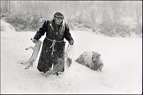
The dust jacket talks of photographs of a ‘vanishing or vanished’ way of life.  I find that quite a tricky idea since ways of life are vanishing and new ones emerging every day and everywhere.  It might be easier therefore to see this as a collection of images of local people who were alive in north Devon in the 1970s and 80s, of their work and social activities, and of the countryside they lived in.  For me the outstanding quality of the photographs is their warmth and humanity.  In her introduction to the book, James’ wife, Robin, says that he got on well with people and made friends easily and that seems to have given him an easygoing approach well-suited to the task he had undertaken.

Ivor Brock rescuing a lamb in a blizzard, February 1978.

Ivor Brock rescuing a lamb in a blizzard, February 1978.

Bill Hammond completing a rick of wheat straw for thatching, 1986.

Bill Hammond completing a rick of wheat straw for thatching, 1986.

That 80,000 image archive though: that’s another matter. When I started studying photographic history I thought an ‘archive’ was some sort of formal description of a well-ordered and catalogued photographic collection.  I soon learned that it was no such thing and could often be little more than piles of boxes or filing cabinets whose contents were only dimly remembered even by those in charge of them.  That may be true of all historical archives, but at least files and other written documents with titles would usually be listed at the very least in alphabetical order.  Photographs have no such obvious device to rely on.

I imagine James Ravilious’ 80,000 images will be better ordered than most since he was creating them as a matter of record and The Beaford Archive was preserving them for that purpose, too.  But in any photographic archive it still takes a formidable cataloguing system to enable a researcher to pull out all the prints on any given subject.  If someone does write a history of the small part of North Devon that he was photographing then doubtless this archive will be invaluable.  For just about everyone else I think the value of his work lies not so much in its depiction of a vanishing world as in the timeless and quiet beauty which emerges from such careful photography. 

Percy and Alice Shaxton, No Place, Ebberley, 1975.

Percy and Alice Shaxton, No Place, Ebberley, 1975.

WAITING FOR THE MIRACLE

A blowy day on the coastal dunes west of Liverpool. The Marram grass which takes up most of the picture and which is so common on these sandy expanses has a very distinct visual quality, particularly in the wind. The light seems to bounce off it endlessly. As I stood and watched, figures came and went. I raised the camera to my eye, hoping for some sort of visual balance between the patterns of the grass and the movement of the people to emerge. You have to be quick because it is there and gone in an instant. (It can become uncomfortable too, standing there with your arm raised and squinting through the viewfinder.) The scene here emptied and filled up once or twice but eventually this moment emerged.

Oly Sept-Oct 20018.jpg

THE HUNGARIAN CONNECTION

I attended a zoom lecture on Hungarian Photography a few days ago.  It was given by Colin Ford, a well-respected photography curator and academic who in 2011 curated an acclaimed Royal Academy exhibition entitled Eyewitness which was mostly about the five well-known Hungarian photographers from the 30s, 40s and 50s: Brassaï, Capa, Kertész, Moholy-Nagy and Munkácsi.   I went down and it was wonderful – just the kind of photography I like to look at: fleeting impressions in black and white shot à la sauvette as the French say - on the hoof.

Most of what he said in the lecture would be pretty well-known to anyone with a passing interest.  All the standard photos were there: Capa’s falling soldier; Kertesz’s underwater swimmer; Munkacsi’s boys at Lake Tanganikya and so on plus various anecdotes and tales about the photographers themselves.  There was even Capa’s endlessly repeated quote that if your photographs aren’t good enough then it’s because you aren’t close enough – which has always struck me, coming from a war photographer, as being a classic bit of Hemingway-esque bragodoccio.

Personally, I’ve always been a big fan of Andre Kertesz – largely for the simplicity of his style.   This one, for example

André Kertesz, Martinique, 1972

André Kertesz, Martinique, 1972

By the end of the talk, however, I found myself coming to the conclusion that in the end, perhaps there isn’t that much to say about any particular photograph – even renowned ones like these.  You might describe the circumstances in which one was taken – though that would be mostly hearsay.  You might try to analyse it as though it were a painting – a fool’s errand, in my view: photographs and paintings are two completely different things.  You might take a theoretical tack, or an anecdotal one but in the end a photo makes an emotional or psychological or cultural connection with you or it doesn’t and that is more or less it.  The words are like minnows round a whale.

Nuns, by the lesser known Hungarian photographer,  Ernö Vadas.  What can words do for this photo?  Just a feast for the eyes

Nuns, by the lesser known Hungarian photographer, Ernö Vadas. What can words do for this photo? Just a feast for the eyes

One interesting point that came up was thia: what is it about the Hungarians – or possibly the fact that all these five photographers were Jewish – that produced this talent?  There was a suggestion that they all struggled with English or other foreign languages and photography was an ideal medium for them to overcome that difficulty.  And Robert Capa did say: "while pursuing my studies my parents' means gave out, and I decided to become a photographer, which was the nearest thing to journalism for anyone who found himself without a language."  It is true that Hungarian is not an Indo-European language and its closest linguistic family members are Finnish and Estonian.  So maybe that does lead to a certain sense of isolation particularly in such a small country.  But why in the middle of the twentieth century only?  It’s not really like Greek philosphers or Italian artists – great flowerings over long periods of time.

This may be a teensy bit controversial but I do think that other factors are at play.  Firstly they are all male and white – which at the time was hardly a drawback and nor is it now.  Wouldn’t the work of Kati Horna measure up just as well?

Kati Horna;  Anarchist Funeral, Barcelona, 1937

Kati Horna; Anarchist Funeral, Barcelona, 1937

Next – at that time, several decades ago, they were photojournalists: it is only latterly the notion of artistic genius has attached itself to them; and not only them but many others.   Once reputations are established and serious money has changed hands, catalogues and biographies have been written and archives are established, a ratchet effect sets in and there is no going back: the escalator will go in one direction only.  All five of them were very talented photographers, of course, but their reputation has been established in exactly the same way over the years as many other non-Hungarians.  The photographs and their history haven’t changed over that time – it is simply that they have now been anointed by the art world on behalf of the shadowy economics supporting it.

In the end, I wonder if nationality is in fact terribly important.  Is there such a thing as French photography, or German photography or American photography?  Colin Ford felt that there is and that sometimes he could distinguish a Hungarian quality about a particular photo.  Perhaps knowledge and experience does make that possible - but I still wonder.

THE FAMILY ALBUM


“There is no time; what is memory?”  So goes the Zen koan. It sprang into my mind as I sifted through a box of family photographs recently and tried to make up my mind what to do with them.  Ones like this for example.

Hass Nov 20 # 014.jpg

This is my grandfather and grandmother with their first child, my uncle Bill, in a studio shot in the mid-nineteen twenties.  My grandmother died about five years later from the tuberculosis which was endemic in the north-west in those years.  My grandfather handed my uncle and mother on to his sister and mother to look after and took little responsibility for them thereafter.  I met him only once or twice and, of course, never met my grandmother.  My uncle is long dead, too, so here we have, more or less three ghosts who live on probably only in the memories of me and my brother now.  The two heroines who took the children on were my great aunt and my great-grandmother.  Here is the latter with my great-grandfather who was also dead by the time of my birth. They’re from the the generation before even the one above so I knew neither of these two either but there are several photos of them in the shirtbox. 

Hass Nov 20 # 016.jpg

Now here is the question: what is the point of keeping photographs of relatives that you either never knew; or who have been dead so long that you are probably the only living person to remember them?  In our family’s modest collection there are maybe a hundred or so images.  But who are all these ladies in cloche hats and men in double-breasted suits smiling self-consciously  in front of charabancs and old motor cars?  Who are these chubby infants in romper suits and Startrites, or staring blankly out of prams with leaf suspension?  There is one of my father holding up a baby – but whose?  Is it me, my brother, a cousin, a friend?

Here’s one of my Dad’s from the war.

Hass Nov 20 # 013.jpg

I wouldn’t mind betting that every person in this photo is now dead.  (As chance would have it, I was chatting to a chap a little while ago who runs a small RAF photography museum.  He told me that as the WW2 generation dies off he is getting a lot of parcels full of these kind of old military photos but, unless there is something of clear historical value about them, he won’t keep them. He doesn’t have the room and, to be frank, if they are of no value to the family then why would they be of value to him?) 

That’s me on the right with my brother at a Pontins holiday camp near Weston-Super-Mare in the early 1960s:  a happy memory for the two of us - but of what interest when we are both gone?

That’s me on the right with my brother at a Pontins holiday camp near Weston-Super-Mare in the early 1960s: a happy memory for the two of us - but of what interest when we are both gone?

My generation (born mid-twentieth century) may be the first to face this problem.  Once Kodak had launched the Box Brownie in 1900 the impromptu family snapshot became commonplace (“Save your happy memories with a Kodak”).  Photographs of our grandparents and parents through the thirties and forties were kept in numbers that were manageable.  But now we have all those monochrome shots from the interwar years and the fifties, plus all the albums of our own families growing up – and there are many, many more of those.  Mrs Barker and I have a full 15 albums on our bookshelves of our own married life. Our recent suggestion to our children that we should cull them down into one or two manageable volumes met with implacable resistance

Albums.JPG

 But if we say that digital images really took off in the first decade of the 21st century, what many families will have is just about a century of proper, physical photographs stretching from the sepia, through the black and white to the full colour.  What’s to be done with them?

I turned to the experts for advice – in this case The Oxford Companion to the Photograph – where I found this under the heading “Family History and Photography:  “….we are often inclined to give these fading fragments the status of evidence.  Yet photographs present a glistening surface of meanings to reflect and project upon, and contain myriad latent narratives.  They are kept because of the part they play in confirming and challenging the identity and history of their users.  Whilst contained within limited photographic conventions, a tension exists between the longed-for ideal and the ambivalence of lived experience.”   

And you thought it was just a photo of your grandad?  This is the kind of treacle you have to wade through if you are interested in the history of photography – vacuous phrases drifting out of a fog of confused thought.  What the author seems to be saying is that even though family photographs can be very simple (“contained within limited photographic conventions” for heaven’s sake….) different people see them in different ways – which is neither news nor indeed restricted to photos of families.

I feel like I’ve got hold of a small root in the garden and that as I try to dig it up it gets bigger and bigger and as I pull harder and harder I suddenly realise that the garage wall is coming down because the root goes much deeper and farther than I had ever imagined.  It does prompt in me the thought however that I cannot make this decision alone.  These are family photographs, so the family must all be involved.  I must therefore spend the next few months finding out what everyone else thinks.  My tentative view would be that we might cull them and then make up one definitive album.  If future family members decide they no longer want to keep it then that is for them.  What will be the basis for the culling though?  Should we keep photographs of family members we can no longer identify?  And what about all those baby shots; and military groups; and football and rugby teams? 

I think again of the koan.  There is no time; what is memory?  A koan has no rational answer.  You are supposed to ‘hold it close’ until your response emerges.  I write it out and slip it into our shirtbox of family memories.  That seems like a good start.

A VERY FINE FOG

The world of phenomena never fails to amaze.

I stumbled my way up Snowdon last year with a camera in my pack.  I didn’t take a single picture on the way up because I was too busy with the exertion of the climb.  When I got to the top there was a thick mist obscuring the view in all directions.  It was very busy, my hands were freezing because I had no gloves and I got well-chilled eating my sandwiches.  There is a small plateau which counts, I think, as the mountain’s official top but there were so many people trying to get up to it that I decided not to bother.  I went just a little further and suddenly the line of jostling forms and sloping stone resolved itself into this:

Oly Sept-Oct 20030.jpg
Oly Sept-Oct 20031.jpg

I have a small series now of photos of figures in fog and mist. They could be seen as a metaphor, of course, but that would be a big mistake. To my eye, they are studies in form. I raise the camera, look through the viewfinder and wait for the scene to resolve itself into some sort of visual coherence. Then I press the shutter button. Simple as that - except that it took me a whole lifetime to get to where I was standing for the 1/60th of a second that each shot took.

We may imagine that we are born into a life waiting for us like a stage set on which we play out our role but I think a better way of looking at it is that the life we are born into is ours alone and is unique. Your life is whatever you encounter and so one else is living the same life as you.   You can’t exchange any part of your experience for anyone else’s but a photograph is at least one way of revealing it.

ZORKI

I hope that the abundance of internet blogs and forums for enthusiasms of so many kinds is not lost to history.  They will make fascinating raw material for future students of our age of distraction.  For example, on the camera kit enthusiasts’ sites you get to witness first-hand the agonies that people undergo when they try to decide which bit of equipment to buy next.  Fellow enthusiasts pitch in with minute distinctions - often just as the enquirer had made their mind up, sending them back into paroxysms of indecision.

I suppose it takes a certain perversity to photograph three coloured stripes on a wall in black and white - but there was a reason.  I was testing a new camera.  Read on.

I suppose it takes a certain perversity to photograph three coloured stripes on a wall in black and white - but there was a reason. I was testing a new camera. Read on.

One such trauma which I witnessed recently was where the guy wanted to buy a Russian camera, but couldn’t decide which one.  First it was going to be a Fed, then a Kiev, until he found out that the Kiev viewfinder scratches your glasses.  Then it was back to Fed until someone suggested Zorki.  And so on.  I deeply appreciated the agonies of this guy. Because it was me.

Some conviction – springing doubtless from a deep internal inadequacy -  had arisen in me that I must try a rangefinder camera.  The rangefinder is a now outmoded but once very popular camera design whose great exemplar is the Leica.  You can easily pay £2000 for a Leica and lens these days such is their reputation – but I certainly wasn’t going to.  The Japanese equivalents are getting into four figures too.  On investigation (yep, those blogs again) I found that there are Russian rangefinders for very much less.  That sounded right up my street.

As keen readers of this blog will know I have form with Russian kit – namely motorcycles.  And the curious thing is that much the same is said about Russian cameras as Russian motorcycles: unreliable, poorly constructed, abysmal quality control and so on.  If you wanted something decent, well-built, reliable and predictable, you had to buy Japanese or German.  It was only if you wanted something more left-field, requiring what was euphemistically known as “user input”, that you might think Russian. 

The parallels are interesting.  Just as the Ural 750 is a copy of BMW machines so Russian cameras are copies of the Leica and the Contax.   And another similarity which I have noticed is that enthusiasts of Zeniths, Zorkis, Kievs and so on share one particular and loveable characteristic with their motorcycling brethren.  I can only describe this as being, well, a very slight nuttiness.  For example, I knew a Russophile motorcyclist who, when he got fed up of customising his bikes, customised his lawnmower.  It was wonderful thing with a two-foot chrome exhaust and metallic paint job which he kept on a display plinth in his back garden.  I knew another guy who had ten Dneprs and none of them actually went.  He used to come to rallies in a car.

As for quality, my personal experience with them was that, so long as you kept on top of servicing and so on, they went well.  So I decided to take a dive into the wonderful world of FSU cameras (Former Soviet Union, if you hadn’t guessed) and I bought this model for 67 quid.

You can get the name in beautiful Cyrillic lettering - but those were destined for the home rather than export market and are said to be of lower quality.  The reverse was said to be true of the motorcycles: the worst ones went to the west.  I wonde…

You can get the name in beautiful Cyrillic lettering - but those were destined for the home rather than export market and are said to be of lower quality. The reverse was said to be true of the motorcycles: the worst ones went to the west. I wonder if any of these legends are actually true?

 It’s a solid and rather beautiful 1970s Zorki 4K which seems to work very well – or it does now that the dealer who sold it to me has fixed the shutter speeds properly.  I’ve had it several months and there are some sample shots below.  The Jupiter 8 50mm lens it came with is a cracker, soft and with lots of depth, so that the subject seems to step out of the background slightly. Like this cow parsley.

I have an obsession with the form of cow parsley in winter.  I find it haunting.

I have an obsession with the form of cow parsley in winter. I find it haunting.

The light was fading and focusing wasn’t easy but beyond that the lens has offered up a lovely softness.

The light was fading and focusing wasn’t easy but beyond that the lens has offered up a lovely softness.

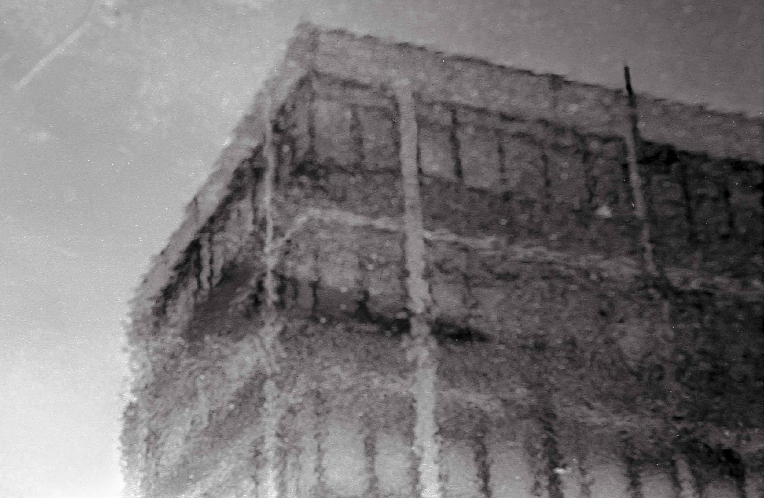
A rather ghostly disused government building reflected in a puddle on a very grey day.

A rather ghostly disused government building reflected in a puddle on a very grey day.

As I familiarise myself with the world of the Russian camera, I find that the generic nuttiness is alive and well.  Here you will find, for example, a guy with the most mesmeric voice on the internet to take you slowly through the details of virtually any Soviet model.  He seems popular and well-informed though, and a true fan.  And at the wonderful Kosmo Foto you can find out more than you may ever have wanted to know about dusty corners of the Soviet Union’s camera world.  It also has fascinating pieces of social history like this article about life as a newspaper photographer in the former Soviet Union; or the upcoming auction of a camera designed for the Soviet space program (estimate of £40-50,000 if you’re interested….)

And what portfolio is complete without a good skip shot?  Street photography at its gnarliest, eh?

And what portfolio is complete without a good skip shot? Street photography at its gnarliest, eh?

I don’t honestly know why I bought the Zorki or whether I will keep it.  The proof of the pudding etc.  A camera’s a camera when all is said and done.  But back on the forums, the footsoldiers of Ebay and Amazon continue their endless conversation,  tormented by detail, minds blown this way and that by the winds of passing opinion and now at least I can say that I have shared their pain.

All  photos shot with the Zorki and Jupiter 8 on Delta 400 film.

All photos shot with the Zorki and Jupiter 8 on Delta 400 film.


AMERICANS IN FLORENCE

Here is another photograph of a young woman – this time one that has become surrounded by conflicting commentary.  There are those who see it as an example of female empowerment and, more recently, those who see it as an example of male harassment. Either way, it seems to have been accepted by all as an impromptu shot of a fleeting street scene.  Yet - is all what it seems, I wonder?

Oly+%23038.jpg

It is entitled American Girl in Florence and was taken by Ruth Orkin in 1951.  The subject is fellow American Ninalee Craig then on a solo tour of Europe.  The two women met in a hotel in Florence and the photographer suggested they do a photoshoot the next day.  Orkin was hoping to get a shot into the Herald Tribune for $15.  It was turned down in the event but published the following year in Cosmopolitan to help illustrate an article about how to travel safely alone.

You can see all the results of the day’s shooting on this contact sheet.  It shows that there were in fact two shots of this scene and that was confirmed by Craig in an interview a few years ago.  “She [ie Orkin] walked about 30 paces ahead of me and at one point turned around to see this scene in the Piazza della Repubblica; she liked what she saw and took a picture……”  And indeed, if you look at the first picture on the contact sheet, you can see that it was taken at a different angle and shows the whole street behind Ninalee.  You can also see some of the same figures as in the second shot – the guys on the motor scooter on the right and possibly the figure furthest to the left. 

Ninalee goes on in the interview to say: “…..She asked me to turn back and do it one more time and took another, and that was it, two pictures…..I think that’s the reason the picture has endured – it was not staged.”

Not staged? But it very definitely is staged, as all the shots of that day were staged. Ruth has asked Ninalee to turn round and make the pass again and this time she positions herself more to the right (presumably in the middle of the road) so that the shot is of the corner.  Here comes Ninalee then, striding along the pavement for the second time.  She says in the interview that she felt “very comfortable in my own skin”.  She doesn’t really look it – and Ruth Orkin is on record as saying that she looked very nervous on the first shot.  But how many of us would look perfectly natural in front of the camera in these circumstances?   

Now – look carefully at the photograph then shut your eyes for a moment.  How many of the fifteen men in the shot are actually looking at Ninalee?  In fact, not many if you look at the crop below.

Oly #038 - Copy.jpg

Of all the ten guys behind her, most seem actually to be looking directly at us. The scooterist is certainly looking at her but the pillion isn’t (more of him in a minute).  Of all those others behind her it is only the chap in short sleeves directly behind the scooterists who is glancing her way.  None of the others are.  Who are they looking at then?  Exactly – they are looking at the photographer.

The three leftmost figures in front of her (in the full picture) are certainly looking at Ninalee but they don’t have a lot of choice because she is walking right in front of them.  They seem almost to be making room for her to pass.  The guy sitting down seems to be looking at the scooterist.  It is the signor clutching his crown jewels who is really the star of the male show, acting it up like there’s no tomorrow, with a comment thrown in too, by the look of it.   Everyone seems to me to be well aware of what is going on and taking an interest in it.  You might even say that it is a good example of how the simple presence of a camera can change everything. So, really, this is not a candid street shot.  It’s more like a bit of street theatre.  The centre of interest is just as much the photographer as Ninalee.

So: female confidence or male leering?  You can make your own choice.  It is worth looking at the rest of the contact sheet though.  In the next few frames, Signor Pillion makes way and Ninalee takes a sidesaddle spin with scooter guy round the square. You can see the results on the same link as the contact sheet above.  They look pretty stilted to me but they did help me finally make up my mind about the photo.  Principally, it is a visual event - a lovely balance of tone, form, expression and movement. I see no need to conceptualise it - but if I were to then it would be more in the sense of Americans and Europeans and how the picture came to be taken.

OF BOOKS AND BACKGROUND HEDGES

            Language is a wonderful thing.  One theory is that it came into existence in early hominoid social groups as a more efficient means of communication than grooming.  I’ve no idea what the evidence is for that but it doesn’t take a lot of imagination to see how important language is in forming relationships and creating status, just as grooming may once have been.  Then what started out as a few grunts and groans ended up as War and Peace, or Hamlet.  Presumably, words just started pouring out, as they still do.  New ones turn up out of nowhere to fulfil a need and disused ones die off.

All the same, it’s not uncommon these days to find someone conjecturing that images will soon usurp language as our primary form of communication.  I think that is pretty unlikely: images cannot make statements and they know nothing of particles such as ‘not’, ‘when’ and ‘if’ and so cannot contain negatives, time, or conditionality.  They can of course arouse emotion - but but they cannot express it.  A photograph of an angry person does not tell you whether the photographer was angry. On the other hand, if I read the words of someone who is very angry I can easily surmise that they are angry (though I in turn may not be).

So the dividing line between words and images is pretty clear.  And when you put the two together you can get some powerful results - advertising and propaganda being two examples. But if you don’t really get it, then the result can be the sort of confusion I noticed in a newspaper piece recently.

Every week in the Guardian there is a Q and A session with a writer in which more or less the same questions are asked: the book that changed me; the last book that made me cry; the book I wished I’d written; and so on.  The writers are generally pretty knowledgeable and, as you’d expect, well-read.  A couple of weeks ago the interviewee was Vick Hope, a broadcaster and writer who this year is one of the judges for the Women’s Prize for fiction.  Her answers showed her also to be intelligent, well-read and knowledgeable.   The accompanying picture though baffled me.  To get the combined effect you can find them both on the Guardian’s website here: you need to see the two together to get the full effect and there is too much to reproduce here. (The quotation under the photo on the website didn’t feature in the hard copy, by the way.)

If you turned the magazine page round and squinted hard at the credits you found that the photo had in fact been shot for an airline company.  Vick Hope is beautifully turned out in an off-the-shoulder evening dress of some sort and she is wearing drop earrings and full make-up.  The foliage background is a bit strange but you can see how it might possibly make sense if you were promoting some sort of international travel.  Her stance is neutral except for the positioning of the right arm, which is rather model-like, and the curious upward tilt of the hand at the hip which has twisted the whole of the forearm up to the elbow and looks a bit uncomfortable.   What I can’t work out though is the connection between this photograph and the words below it about Vick Hope’s tastes in literature.  The two are miles apart – they aren’t even within waving distance.

This is not to say that a woman who dresses in a glamorous evening dress and drop earrings cannot be a perfectly serious literary figure.  Obviously, she can.  But for the purposes of the Guardian literary pages the picture adds nothing to the Q and A session.  There is no mention in the text of travel, parties, fashion, or even an interest in background  hedgerows.  Text and image are about two completely different things and you wonder why on earth they were ever paired together like this.  The photo does not supplement the text.  It illustrates nothing.  And the text tells us nothing about the photo.

This is not uncommon. There will be a press article about someone whose appearance is of little relevance to its contents. Yet the inevitable photograph appears next to the text, floating around like an unmoored barrage balloon. It makes me think of C S Lewis and his famous lecture on The Two Cultures. He argued that the many contemporary ills (this was 60 years ago) could be traced to the gap between the two worlds of science and the humanities. Scientists knew little of the humanities and humanists knew little of science. The same is true now of the visual world and the verbal world. Visual literacy is for specialists - and those specialists do not always have the best of intentions.

This is the great unexplored area.  Words are powerful.  Text is powerful.  Working together they are unstoppable; yet we are still at the grunt and groan stage in analysing the text/image relationship.  The ideas have not yet emerged which could throw a bridge across the waters dividing the two.