NOSING AROUND

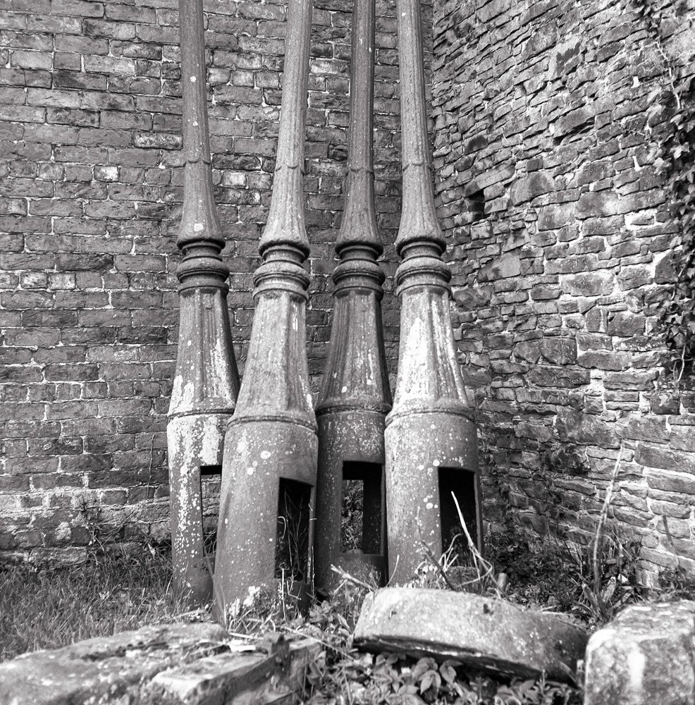
Bromholm Priory, ruins of Chapter House wall.

If you have the time and means to nose around the backwaters of the UK you will generally come across something of interest sooner or later.   You might need a map, and you will definitely need a sense of curiosity and an open mind, but you will get there.

Recovering from a shambolic lunch in a Norfolk café this summer (howling dogs, bizarre salads and bickering staff) I set off on a walk round the coastal village of Bacton to clear my head.  A workman trimming hedges stopped to let me pass and as I turned to get past him I saw, a couple of fields away, the magnificent ruin above.  I asked him if it was possible to get closer to it.  He told me that it was part of an old monastery, now on a working farm; that he and his pals had played there as children; that a new farming generation had banned them; but the very latest entail holders seemed not to mind visitors.  So I marched up the drive to a kind of Gormenghast Hall in a deserted farmyard and rang the bell.  Nothing.  I rang again.  Shuffling of feet.  Door opens.  Darkened hallway.  Young man.  Could I look at his ruins?  Sure, he said, and shut the door.

Bromholm Priory, ruins of refectory wall.

So - I looked.    There wasn’t much to see bar these walls and some unkempt farm buildings and machinery but that just stimulated my imagination all the more.  All around me stretched the big East Anglian skies and flat landscape.  The sea was only a few fields away. A shower of rain fell.  The wind blew. The atmosphere was breathtaking.  Something ineffable pulsed for a second and then was gone.  I stared through the Hasselblad’s ground glass and clicked several times. Then suddenly it was all over and I found myself standing in a farmyard in Norfolk.  And a scruffy one at that.  So I resumed my walk and got soaked in a second shower.

Bromholm Priory, ruins of Chapter House.

(You can find out more about Bromholm Priory, a Cluniac monastery built in the 12th century and suppressed in the 16th century - together with a lovely little 3D model of it put together by The Paston Heritage Society - here .

I took the photos with a Hasselblad 500CM on Ilford FP4+ rated at 200 and developed in Ilford DDX. )

DARKROOM FEVER

Here’s a neat little graphic from the B&H Photo site which I hope they won’t mind my using if I give them this shameless plug: they are clearly enthusiasts and have really useful articles on all sorts of phototopics.

Last December, keen readers of this blog may remember, I took delivery of an Intrepid darkroom enlarger. I had helped crowdfund its development though I have no idea why - an impulse, I suppose.  Once it arrived I couldn’t be doing with it, so I put it in a cupboard.  To salve my conscience I said in my blogpiece (with a bravura that I didn’t really feel) that I would commit to producing by the end of the year a picture which I had darkroom developed and printed, then mounted and framed myself.  Well, the end of the year approaches – and I have not been  idle. 

In Spring, to convince myself that I was on the job, I bought a darkroom easel and focus magnifier secondhand from my local Real Camera Co.  Then feeling a certain resistance again I put them in the cupboard with the enlarger.  In these situations it is always best I find not to push things.  They will eventually happen of their own accord (or not, of course, just depending).

Late summer I found myself cleaning out the shed and realised this was a displacement activity.  For what, I wondered?  Then I found myself cleaning out the loft.  Aha!  I had been intending to use the bathroom as a darkroom but as I looked round the loft I realised it was a much better space though it had no running water.  Never mind.  I fashioned two rooflight blackouts from picture backing board and covered those with black cloth.  Then I bought some plyboard and black felt to block the trapdoor opening.

From ebay I bought a copystand to suspend the enlarger and an enlarging lens (a very fine Rodenstock Rodagon and the nearest I have ever come to getting a bargain on ebay).  I ordered some chemicals, trays and sundries and, miraculously, I was ready to go.

The first session was very tentative – not least because the rooflight blockers kept on falling down and flooding the space with light at the crucial moment of exposure.  I recategorised them as prototypes and wedged them into the velux frames more firmly.  Brute force, but there we are.

The lack of running water in the loft means that I can print only one or two photos at a time before shlepping them down the loftladders and into the bathroom to wash them.  Time consuming, but it does keep me fit.  By the end of the first session I had two test strips and three prints and I count that a success.  Second time round I got a bit quicker and produced two sets of contact prints; four test strips; and four working prints.

Some early conclusions:

·       It’s true what they say: when you see the picture appear in the developing tray – it’s magic;

·       It’s nowhere near as complicated as I had imagined.  The basic process is pretty straightforward even though producing a fine print is a great skill;

·       It’s not cheap.   I have spent over £500 though it could probably be done for half that with better husbandry.

The real revelation for me though is this: that looking at a photographic print fresh out of a developing tray and looking at one from a scanned negative on a computer screen are two completely different experiences.  The darkroom print is a bit like talking to someone in the flesh while the onscreen version is like talking to them on zoom.  No comparison.  

It’s now mid-October, so about ten weeks till the end of the year and my self-imposed deadline.  Werhoo - almost there.

HAIBUN*

I go into a cool café, sit down, look around.  Young couple chatting to my right. Over the way a woman deep in her laptop.  Wedged into a corner table - another couple: she like Beth Ditto and he a young James Baldwin.  My snap judgment is that they don’t know one another very well.  Her laugh is staccato and his tone very low.  I can just make out her American accent but only an odd word or two floats over. The waitress takes my order, I switch to another bandwidth and pay them no more attention.  A while later, I don’t know how long, I become vaguely aware of a silence around them.  I hear no farewell noises but he gets up and, passing my table, turns back to her and hisses:  “ I hope you die in a head-on”.  Then walks out.  It takes me a second or two to grasp the words, then I glance at her.  She has picked up a book and is staring at its pages but I can see that her eyes are reddening. 


neverending

speakers stream

cool jazz

*A haibun is a traditional Japanese form which combines prose with haiku.

UNNECESSARY OBSTACLES


I’d had several goes at taking this photo but none of them came out very well, mostly because I haven’t got a lens wide enough to get the whole pylon in plus a bit round the edges for spare.  So one dry day I went back with the mighty Hasselblad, lay down on my back and took a couple of frames straight up.  Getting up and dusting myself down, I saw a chap detach himself from a passing group.

“Is it a Hasselblad?”

“Yes” I said and showed it to him.

“Did you get it all in?” he asked, gesturing at the pylon towering over us.

“I’m not sure”

He whipped out his iphone, scrolled down, and held it up to me.  On the screen there was a perfect image, taken from below of, he told me, this very pylon.  It was exactly what I was trying to capture on film.

His iphone had two advantages.  Firstly, its lens is much wider than the Hasselblad’s and so it was much easier to capture the whole of the pylon’s base.  Secondly, you can take as many digital shots as you want and have a look at the results in situ until you get exactly what you are aiming for. You can’t do that with film.

Such an experience is chastening for the film photographer but only momentarily. As I continued my walk the phrase ‘the willing acceptance of unnecessary obstacles’ popped into my head.  It was coined, I believe, by a sports coach named Bernard Suits as a general characterisation of sport. Accepting more obstacles, he said, brings improvement for those who are able to overcome them.

I consoled myself with the thought and then turned my attention to the reeds along the waterside as I walked. Their spindly delicacy always catches my eye when I take this route. Take that, iphone!

TWO LEGENDS: VIVIAN MAIER AND MILTON KEYNES

Vivian Maier, Self Portrait, New York 1953.

I had never been to Milton Keynes - if we can discount a night many  years ago spent in its bizarre and sadly now closed Youth Hostel - so when I noticed that there was a Vivian Maier exhibition on at the MK Gallery and that MK was more or less on the line of the drive home from our Essex holiday, I thought this was a chance to investigate two putative legends in one day.

A bit like VM, MK is very much a one-off.  One of several new towns planned and built mostly in the 1960s, It came out of nowhere and is now  the subject of several legends which may or may not be based on fact:  for example, that it never rains in MK; or that its main thoroughfare is aligned with the  sun’s rays at the midsummer solstice; or its concrete cows were once repainted with pyjamas on; or that it is haunted by the ghost of Dick Turpin.

And VM?  She is entering the realms of legend, too.  Her posthumous trajectory from anonymity to fame is now well- known.  For anyone who has missed out – she was a New York-based nanny who photographed secretively and obsessively throughout her life creating, apparently, 150,000 images.  When she died in poverty these and other possessions weighing about 8 tons were stored in a New York lock-up to be randomly discovered in 2007, printed and displayed to an acclaim she had not sought in her lifetime.  So, since comparatively little is known about her or her life, her rise to the status of legend has been unhampered by too many facts.  And perhaps unsurprisingly, given the brouhaha about her life, her legacy and her copyright, the pictures themselves seem to have been a bit in the background. 

There were about 150 photos in the exhibition “Vivian Maier: Anthology” at the MK Gallery, set out in several spacious and well-lit rooms. The curator, Anne Morin, had taken the tasteful decision to make very few comments but there were panels with a few paragraphs by other commentators which give a helpful range of views.  And, wonderfully, there was not a black or white frame in sight: the photographs were in proper wooden frames.  Ten out of ten for that. 

There is no doubt at all that Vivian Maier was a talented photographer but for me, two things at the exhibition were particularly noticeable:  the first was her speed of reaction; and the other was the range of images. In both of the photographs below she has caught in an instant a characteristic urban expression, somewhere between pugnacious and defensive.  (Some might think it particular to New York but I think it is more universal and can be seen any day in any big city.)  As a photographer you need to be pretty quick and pretty pugnacious yourself to catch that fleeting look.

But she also caught the quieter moments, too.

Other photos in the exhibition ranged from the abstract to the gritty and on to the surreal - like the one below.

 There was a real mixture which amounted perhaps to a kind of mosaic without any particular pattern.  Mid-century New York is a bit of an overworked trope now photographically, but the wall panel commentaries did a heroic job of trying to detect themes in the work. I think the truth though is that the photographs are captivating but random.  She photographed anything that caught her eye.  What’s wrong with that?

Two legends in one day is not bad going.  Neither could happen again: Milton Keynes because that kind of central planning is so out of favour now; and Vivian Maier because it’s unlikely that today’s digital capture and storage would survive her death.  So hurray for the twentieth century and its analogue ways.

All photos ©Estate of Vivian Maier, Courtesy of Maloof Collection and Howard Greenberg Gallery, NY.

The exhibition Vivian Maier: Anthology continues at Milton Keynes Gallery until September 25th.

AN ACT OF FAITH

You may have noticed this image in the newspapers over the past few days.  It is one of the first produced from data supplied by the James Webb space telescope – the replacement for the well-known Hubble.

NGC 3324 “Cosmic Cliffs” Image credit: NASA, ESA, CSA, and STScI

 My blood pressure always rises slightly when I see such things passed off as photographs - as they often are, at least by implication.  They aren’t photographs.  I wrote a little bit about the sleight of hand by which data visualisation can rather too easily simulate the photographic in an April 2019 blogpost called Black Holes (just scroll down far enough below and you will come to it).  Imagine my delight then to read an article in ArtReview magazine by Pippa Goldschmidt which set out the whole issue rather more fully than I did.  You can find the article here and in my view it is a must-read for anyone with pretensions to visual literacy today. (And you can read NASA’s own gushing prose here. They even talk of the “crisp resolution” of the telescope’s NIRcam (Near Infra-Red Camera)).

I won’t steal her thunder but in her article Pippa points out that NASA has a whole team dedicated to the conversion of the numerical data sent back by the telescope into a visual image.  The range of colours used even has a name: The Hubble Palette.  And if you think that the image above is vaguely reminiscent of something then…..well, just read the article. 

We spend our lives peering out through this letterbox apparently formed by our two eyes.  It is perhaps a natural endeavour for the NASA team to try to stuff the vastness of the space into an envelope small enough to post through that letterbox.  Might it not be wiser, though, to accept that the unknowable is unknowable?  What we cannot see, we cannot see - no matter how much we believe it to exist.  What NASA is doing seems to me to be much the same as a medieval artist painting angels. It’s an act of faith.


OVERKILL: SEBASTIAO SALGADO'S 'AMAZONIA'

Sebastiao Salgado needs no introduction.  He is photographic royalty.  If you need reminding of that then you can read a litany of his achievements on a large wall stencil at this touring exhibition currently showing at Manchester Science and Industry Museum. What’s more, if you did have any doubts about the quality of his photographic work then the exhibition’s promotional material will put you straight.  It is, we are told, “incredible”, “powerful”, “breathtaking” and “stunning”.  It is “beautiful and evocative” and “Visitors can’t fail to be inspired” (so if you do fail to be inspired that’s your problem, right?).  The press release, apparently without irony, calls it “a blockbuster”.

What, then, does the visitor get at this exhibition?  There are over 200 photographs which can be divided generally into landscape and portrait images.  The landscape photographs are unframed and vary from big to huge.  I didn’t have a tape measure with me but I’d estimate the biggest to be about 6 by 8 feet and the smaller ones to be about 5 by 4.  Those biggest ones are on the side walls and the rest are hung from the ceiling.  They are divided physically into sections in the exhibition: The Forest; The Mountains; and so on.  In the middle of the main exhibition area, in settings designed to represent indigenous housing, are smaller framed and mounted photographs which are portraits of several groups of local peoples and of their way of life.  These are mounted and framed in some sort of laminate.  All the images are black and white. 

Gallery View courtesy of Manchester Science and Industry Museum

The curator of the exhibition, Leila Wanick Salgado says in her notes that the purpose of hanging images at different heights and in different formats is to make the visitor feel enveloped in a forest.  The photographs are interspersed with written material which varies from the factual and informative to the campaigning or hectoring depending on your point of view. “It is the duty of all human beings across the planet to participate in its [Amazonia’s] protection”, we are admonished at one point.

Throughout the main exhibition is a soundtrack by Jean Michel Jarre “inspired by the authentic sounds of the forest”.  In addition, there are two separate soundtracks in side rooms.  The first, by Brazilian musician Rodolfo Stroeter, accompanies a slide show of portrait photographs.  The second is a symphonic poem by Villa Lobos and accompanies a slideshow of landscape images.  With the three soundtracks, at certain points in the exhibition you get what I think of as The Debenhams Experience where the music being played at one concession clashes badly with that being played at the concession next to it.

Finally, the visitor hacks his way through this sensory entanglement to the photographs themselves.  These are in Salgado’s hallmark style – powerful, contrasty images of a kind which has been widely admired throughout his career.  There is no doubt that he is a very accomplished photographer in what I would call the Transcendentalist tradition.  Whatever the titles and subjects of his various books and exhibitions, his underlying theme is of the inherent goodness of people and nature and their corruption by society and its institutions.  Roiling skies abound.

Mariua Archipelago, Rio Negro, Brazil, 2019, © Sebastiao Salgado.

There has been much discussion of his method over the years but the consensus now seems to be that he uses digital cameras to capture the images and then produces what is known as an internegative to swap them back into an analogue workflow for wet printing in a darkroom to get the traditional film look. 

 There is no denying that the landscape images in the exhibition are powerful but there is only so much a photographer, even of Salgado’s standing, can do with the river/jungle/sky troika.  The smaller,  mounted images in the centre of the exhibition speak with a quieter voice.  There are some lovely, unaffected portraits with background notes about the people and their culture.

I think the exhibition’s big problem is that the photographs are not allowed to speak for themselves.  They are badly hemmed in by the curation.  For example – why are the photographs printed so big?  It is very fashionable, of course, but photography is a reductive medium: you can, almost literally, hold the world in the palm of your hand.  The unspoken suggestion seems to be that the bigger the image the more impressive it must be.  But this gives the practical problem that the observer has to stand well back from such large images and in places the hanging arrangement hampers that.  One photo gets in the way of the sightlines for another.  Plus, on top of the 200 or so images you have three sets of music, two slideshows, a documentary of indigenous leaders, extensive wall annotations, no natural light and and occasional tannoy announcements from the museum.

As I was walking around the exhibition a scene jumped into my mind from the film Spinal Tap – the famous “eleven” scene where guitarist Nigel is explaining how the band’s amplifiers go “one louder” than all the other bands just for that “extra push over the cliff”.  It made me think - they could have called this exhibition “Amazonia – Eleven”. 

Just sometimes, photography is pure magic.  In a split second it can spark up  the mind’s electrodes and fire the imagination to great heights. This is the true power of the medium but it takes faith to let photography speak for itself and not heavy-handed curation.  There are doubtless those who will love the total immersive experience but it wasn’t for me.  These images need silence and meditation.  I came out desperate for a bit of peace and quiet.


“Amazonia” is at The Science and Industry Museum, Manchester until 14th August.


MORE THAN A PILE OF PEBBLES

 Question:  how many Zen Buddhists do you need to take a photograph?

Answer: None. The photograph takes itself!

Well, even I’m not satisfied with that as an answer.  Obviously, you need some human intervention.  But what sort?

Standard Zen photos seem to major on things like carefully raked sand or gravel; piles of pebbles; long exposure shots of the sea; distant horizons with nothing in the foreground; and so on.  The recurring theme is stillness or calm but the subjects are very hackneyed.  Moreover, in my understanding of Zen practice, calmness is not to be preferred over any other mental state.  If you seek it out you simply have yet another attachment.  It may or may not be a by-product of the practice, that’s all.  So what are we aiming for?

In The Zen of Creativity (Ballantine Books, 2005) John Daido Loori says that the essence is ‘no intent’.  “The activity, whatever it may be, is not  forced or strained.  The art just slips through the intellectual filters, without conscious effort and without planning…..a continuous stream of spontaneity.” At its heart, it seems to be an absence of expectation. With photography, that is very difficult to achieve since hovering in the background there is always the idea of “good” photography and “bad” photography. This is something we have to get over, to banish from our minds.

So when I finished my recent retreat I was interested to see what sort of photographs would emerge from the 24 hours or so of the post-retreat period – a walk in the surrounding countryside and then up the coast.  Here are several examples below so you can make up your own mind about whether or not they have any quality in common.

Abandoned street lamps, Crosby

Weathered Barn, Crosby.

Liverpool blitz debris, Crosby.

Coastal scene with disused groynes, Crosby.

Unidentified structure with graffiti, Crosby.

Well. To my eye the answer is a resounding “Maybe”. They re possibly a little over-pictorial (just nice pictures) but perhaps they do have a good slow pulse as well.

PASSING CLOUDS

I happened across a  copy of  Walker Evans’ ‘American Photographs’ in a charity shop for £3.49 recently – which seemed like a good deal.  According to  a MOMA essay it is “still for many artists the benchmark against which all photographic monographs are judged”.  I’ve never quite understood why, though: I can see its value as a historical document and as Evans’ attempt to set out his stall photographically speaking as a documentarist; but so many of the images, especially towards the end, seem a little lacklustre.  I turned to the standard Photo encyclopedias – Frizot, Marien and The Oxford Companion, and none of them seems to take a standard view.  He does get two mentions in Honour and Fleming’s ‘World History of Art’ however and having browsed the book and the internet (where there is a terrible lot of gushing prose) a bit more I think that probably his strength was in making straight no-nonsense photographs of socially important matters.  This doesn’t necessarily make for particularly eyecatching photographs but if you hang on in there a certain homespun ordinariness does emerge even if it is often at the expense of visual interest.

The very well known photo below set me thinking. 

“Alabama Cotton Tenant Farmer Wife” is the title in “American Photographs” but it seems to be better known now as ‘Ellie Mae Burroughs’. Taken on my iphone from my copy of “American Photographs” 1988, © Museum of Modern Art, New York.

 Why is it, I wonder, that portraits of otherwise anonymous subjects always stand the test of time better than those of celebrities of the day? Here is a shot by (the very great) Jane Bown of Edith Sitwell in 1959.  Which of these two photographs has more substance now? 

Dame Edith Sitwell, 1959 by Jane Bown and taken with my iphone from my copy of “The Gentle Eye: Photographs by Jane Bown” © The Observer 1980.

 Celebrities, I suppose, have an expectation of being recognised.  That, after all, is why they are being photographed and it shows in their minor performances for the lens.  The Common People have no such  expectation and maybe that is why, as subjects,  they have a certain timeless quality: their importance was local, not global, and is unaffected, unlike celebrity, by the passage of time.

A WALK IN THE WOODS

In April I wrote a blog post about a retreat that I had been on.  I thought that I had finished with it as a subject but when I came to develop and scan some of the photos I took I realised there was something else to say.

The location of the retreat was an educational trust housed in some beautifully refurbished farm/manor buildings next to the grounds of a later manorial building,  possibly 18th century,  itself surrounded by extensive fields and woodlands.  As a retreatant you have the right to wander in these grounds.

Sycamore leaves in April. Beautiful patterning.

One morning I decided to take myself off during free time with my Rolleicord.  It was just after I had taken the photograph above that I noticed a figure approaching.  I had seen one or two random dog walkers on other days but this chap looked a bit different.   He was dressed as if by one of the better kind of gents’ country outfitters circa 1960: leather, waxed cotton, moleskin, a trilby.  A suspicion formed in my mind.

I was approaching from his right and could see that I would have to exercise a quarter-turn back onto the main path and so pass him.  Clearly we could not ignore one another.

“Good morning” I said to seize the initiative.

“Good morning” he replied.

I think there may have been a few words about the weather then - silence.

Then he said, “Who are you?”

Since we were both Englishmen of a certain age and therefore in the business of Giving Nothing Away For The Moment conversationally I thought this was a tad direct.  I clearly wasn’t a dog walker since I didn’t have a dog   But he had asked me so I replied.

“I’m Peter” I said.

This had the merit of answering his question yet revealing nothing.  (I think that somewhere in the back of my mind was a scene from a Just William story in which William meets a Great Actor somewhere in his village.  After a short exchange the Great Actor booms at William: “Don’t you know who I am?”  And William replies: “No, an’ I bet you don’t know who I am either.”)

By now, my suspicion had turned to certainty.  This was the Lord of the Manor.  He clearly did not see it as his place to explain that and so I had to take him by the hand conversationally, so to speak.

“You’re the owner?”

“Yes.”

I explained that I was a retreatant from next door.  (Who else would be walking around his private forest, I wondered, and then thought of the dog walkers. Maybe he was patrolling.)

“Of course you are!” he cried.  “How stupid of me.”

For my part, I wanted no toff-meets-commoner politenesses so I yanked the conversation right round and asked about  how he managed the woodlands.  Very little, seemed to be the answer.  Then I asked about the many, many yew trees and their age.  But he, in turn, was having  none of my man-to-man egalitarianism.

“Not very old” he shrugged,  “The Victorians were very fond of them, you know”  Was there just a hint of lineage there, I wondered.

I thought that I had done my bit for inter-class harmony by that point.

“Good to meet you” I said.

“Quite” he replied, and we went on our separate ways.

He seemed a decent cove and I would like to have stayed chatting to him for longer but I didn’t think he was inviting it.  I did get this photograph of a beech tree below, though, immediately after.

It was just before taking this picture that I had the encounter above. This is a magnificent beech which stands at the crossing point of two woodland paths. Or is it two beech trees wrapped round one another? I should have looked a little more closely. Now what I see is two trees locked in a lifelong embrace.

MEDITATION


(An experiment with text and image)


Sometimes, floating away, I find myself in a beautiful city, not unlike Paris perhaps, where broad boulevards are dotted with attractive and civilised people chatting, strolling, sitting on benches and enjoying the sunshine.  Often they approach me and ask whether I have seen this or that cultural site or to alert me to a new and humane text which has been published or to the latest parkland blossoms flowering nearby.  Cool breezes temper the warmth and I am filled with a sense of well-being at the prospect of happy hours ahead.  I cannot help noticing however that crowds are gathering around monitors where flickering letters and numbers, supported by distant and indistinct announcements, seem to be about some form of lottery or game of chance.  These are not the final results it appears, but some sort of interim stages of a process whose beginning and end are no longer of consequence.  Yet each time I approach a monitor myself to see if I can decipher its display I find that another denizen of this charming though curious city has taken me by the elbow and is enquiring after my health, directing me to a particularly beautiful viewing spot or otherwise distracting me from those subtly glowing screens.

THE CLASSICAL DARKROOM

For a long time, in my head, I have associated Classical with the idea of endless refinements of a given theme; and Modern with endless innovation.  Being a child of the sixties and seventies  I always found the former to be rather tedious: those eternal artistic representations of religious scenes, say, or drama shackled by the unities of time, place and action.  Meh.  Who needed these constrictions when you could throw away the rulebook and do whatever you wanted?

A couple of years ago when I started developing my own film the shortcomings of the Modern approach became clear pretty quickly.   I started by trying a few different developers and a few different films.  The result was chaos: this developer with that film; that developer with this film; add a few seconds here; shave a few seconds there; agitate a bit more; agitate a bit less; dilute a bit more, dilute a bit less.  A rulebook of some kind was definitely needed.  The problem then turned out to be not that there were no rulebooks but that there were too many rulebooks.  There seemed to be experts at every turn.  Everyone on the net has an opinion. Enough, I decided, was enough and I went back to the drawing board.

For authoritative voices, I decided, we need to step back in time to when there was less shouting. Some time ago I bought a copy of Henry Horenstein’s 1983 “Black and White Photography: A Basic Manual”; and more recently Andreas Feininger’s 1965 “The Complete Photographer”. Neither breaks the bank and both are full of sound practical advice for the tyro developer and printer. They can be a little outdated technically but they are authoritative in the good sense of definitive and helpful. This weaned me off internet advice.

Film is not dead yet, for sure.  Not only are plenty of products on the market but new ones are appearing frequently.  I decided that, despite all the siren voices from the margins, the thing to do was to go mainstream.  I’d always had perfectly acceptable results from Ilford products – and I particularly like the way they seem to handle the mid-tones in black and white (if I’m not imagining it).  They have the added advantage of manufacture only a few miles down the road from where I live.  And middle of the Ilford road are two traditional films: FP4+ for the summer months and HP5+ which needs less light, in winter.  At 35mm I found I wasn’t keen on the very grainy results from HP5+ so I tried Ilford’s more modern equivalent, Delta 400 and much preferred its smoother look.  That nailed down the film side.  The two middle of the road Ilford developers are ID-11 (recommended by Ilford for the traditional films) and DD-X for the Delta range.  I haven’t made my mind up about those: the ID-11 is cheaper but  you need a litre for two medium format films.   It comes in a powder form that you have to make up to a solution, so if you buy I any bulk you end up having to store several litres if your photographic output is modest like mine.  DD-X  comes as a concentrate which you dilute as you go so needs less space and fewer bottles to store.

General opinion seems to be however that that grainy old HP5 is not at all as grainy at medium format because the negative is bigger and therefore the tonal changes are smoother.  I’m not sure I buy that because any given square centimetre of negative with a given emulsion should presumably give the same results with any given developer regardless of the total size of the negative.  All the same I have bought some HP5 medium format to try out.

My aim is to get down to two films, one for winter one for summer, and if possible one developer.  What I am looking for is predictability rather than experimentation: a steady platform.  To my surprise therefore I find myself ditching the Modern and siding with the Classical: endless repetition within very narrow technical conventions.  Who’d have guessed?

This is Delta 100 film shot on an Olympus OM-1 and developed in ID-11. Youi can still see some grain - especially in the sky. Would it have been any smoother if developed in the recommended DD-X? No idea but maybe one day I will be in a position to say. I find it very difficult to resist these scenes of the human figure way off to one side in an empty landscape - or seascape, as here. They seem to replicate my feelings about the individual and the world.

ARTISTS WITHOUT BORDERS

In all the terrible news coming out of Ukraine a small article about Mariupol caught my eye recently.  It mentioned that one of the buildings damaged by shelling was the Kuindzhi Art Museum and reported that some art works had been looted by Russian troops.

My mind immediately raced back to an exhibition of Russian landscape art at the National Gallery in 2004 in which I first came across the work of Arkhip Ivanovich Kuindzhi (1842-1910).  I was really taken by it and did my best to find out about him in my frequent subsequent trips to Russia.  I’d also been reading up on the Russian mystic/philosopher/artist (and, some say, spy) Nikolai Roerich.  On a visit to the Roerich Museum in Moscow as I peered closely at an old photo of Roerich’s art class I realised with a bit of a shock that his tutor was….yes, Arkhip Kuindzhi.  All of this clearly required more investigation and I spent some time finding out about the two of them.  This was all twenty-odd years ago and I have had several reproductions of Kuindzhi’s work and one of Roerich’s hanging in our house ever since.  My researches didn’t lead very far though. There is quite a bit on Roerich in English but Kuindzhi hardly gets a look in even though he was a very popular artist in his day and his work is still of some standing. Browsing the net, I noticed in a recent Sotheby’s sale that one of his paintings sold for around $3million.

Kuindzhi was an absolute master of illumination – both by sun and moon. 

Moonlight on the Dnepr. 1880.

Ukraine Evening. 1878-1901. Russian State Museum, St. Petersburg.

Morning on the Dnepr. 1881. Tretyakov Gallery, Moscow.

What attracts me most is not his technique though but the suggestion of emptiness and presence at the same time – that spaciousness which borders on the spiritual. ‘Morning on the Dnepr’ is a painting almost of nothing.

I’ve always been particularly struck by this one below, too. It is one of several he painted which carry the title “Birch Grove”.  Am I the only one to see a very definite suggestion of a split down the centre of the painting – almost a rent in reality?  It is a little exaggerated by the colour tone in this reproduction but I have seen the original and it is definitely there, believe me.

Birch Grove. 1879. Tretyakov Gallery, Moscow.

There is very little written about Arkhip Ivanovich Kuindzhi in English – that I have ever found anyway.  He is not even mentioned in Honour and Fleming’s World History of Art.  In other sources  he is simply referred to as a Russian artist.  I’d have to be honest and say that until recently I wouldn’t have quibbled with that.  Despite my interest I had never even heard of the Kuindzhi Art Museum.  Now it is brought to my attention in the worst of circumstances. And it dawns on me why it is in Mariupol. It is in Mariupol because, as I now remember, that is where Kuindzhi was born.  He was Ukrainian.* At the time the Crimea was part of the Russian Empire so perhaps there was some justification for calling him Russian.   The distinction might have passed most of us by once upon a time, but not any more.  

Here’s my homage to to Arkhip Ivanovich – my own little birch grove a short walk from our house. (Taken coincidentally with a Russian Zorki 4K.)

* Kuindzhi is not on his own either. Vasily Grossman, author of Life and Fate and often referred to as Russian was also born in Ukraine - as was Mikhail Bulgakov, author of The Master and Margherita. I wonder how many others there are?

ZEN AND THE ART OF PEERING THROUGH A VIEWFINDER

I’ve just come back off a six day Zen retreat – my first for two years since none have been held over the lockdown period.  This one wasn’t my usual Zen group but most such retreats are pretty similar.  There is a lot of sitting meditation, zazen as it is called - but it is the way that these events are set up which is perhaps most important.  There is a timetable of zazen, work periods, meals, some instruction or talks and a little ritual or chanting of some kind.   Once you are into the swing of this there is very little to think about.  Next, you are in silence.  You don’t talk to anyone or otherwise make contact with them – even eye contact if you are going to do it properly.  You don’t bring books to read, laptops or tablets to browse, paper and pen for jotting things down or any other little sidelines.  You put your phone away. There are absolutely no distractions.

When there is absolutely nothing to think about, what happens?  Oddly enough, thinking happens.  At first, in fact, the mind goes into overdrive.  I have been on many of these retreats and the first day is always the same: a bumpy ride.  You might have thought that thoughts were the product of your life’s round but it turns out that they come and go more or less as they please.  The zazen is usually about five or six hours a day so you have plenty of time to contemplate this  dizzy spinning of the mind.  Sometimes a little peace and quiet develops but it always, in my experience, goes away again.  This is what our minds do: they come and go like a lighthouse beam.   So the mind is itself often a distraction in its own right.*

Photography is not generally considered to be one of the Zen arts. Traditionally, that is more the realm of calligraphy,  poetry, brush painting and so on.  However, zen insights can easily be transferred to photographic practice.  On second thoughts, I think maybe we should knock that word ‘easily’ out of the sentence.  Let’s just say that it is possible to transfer them.

When I look through the viewfinder I often find that my mind starts doing its thing again.  “This will make a good photo!” it says and off it goes.  The moment that I allow myself to be distracted from what I see in the viewfinder by this chatter, and to wander away from the moment, I lose whatever clearsightedness  brought me to the scene at that very second.  Sometimes I put the camera down and keep walking.  Sometimes I repeat to myself: “What is this?  What is this?”  Sometimes I am not distracted at all and the photo takes itself.

It was an absolutely beautiful morning as the retreat ended and I took the chance to have a walk up the nearby coast with the Rolleicord.  I like to think that the photos I took will reflect a certain otherworldly serenity but I have a nasty feeling they may look more like desperate attempts to capture ghosts.  It will take me a few weeks to get around to developing and scanning them but I promise to put one or two into a blog post to see whether they amount to anything interesting.  In the meantime, here is a photo which more or less took itself once I had got out of the way.

I took this photo on a very wet afternoon in Bristol last autumn. It’s a streetscene reflected in a giant mirror orb. It was a good exercise in not thinking because the panels broke up the scene so that I could only react in a split second to whatever appeared. The thinking mind can’t cope with that so spontaneity takes over. I guess that it is all about playing, really.

*Mind does tend to get a pretty bad press in the world of Zen so I would like to record here my deep respect for all those mental processes which have contributed to the survival of the human race over the centuries.  After all, you wouldn’t cross a busy road in contemplative mode, would you?

SHAHAI

My attempts to marry up photographs and words in a satisfactory way continue to frustrate me.  Some days I find myself thinking that maybe in their purest form neither has need of the other.  Certainly when I try to put mini-texts up with photos as I have described in previous posts the results generally fall flat.  So when I spotted a webinar run by the East Midlands branch of the RPS on the subject of Photography and Haiku I was onto it like a shot – as were 250 other attendees.*  I am clearly not on my own.

The session was led by Alan Summers and Karen Hoy who themselves offer many haiku/haiga/tanka courses via their website Call Of The Page.  Alan opened with the historical basis for modern experiments with photographs and haiku – which is the Japanese haiga.  He translated ‘haiga’ as ‘playful painting’ and set out its three main characteristics as: a painting or drawing; with a haiku; in calligraphic script, like this one below.  

Hakuin. Wren The haiku translation is: “it looks/like a nightingale/but it’s a wren” (Hakuin is making fun of his own limited artistic abilities.)

The characteristic that I have noted mostly of these haiga is a kind of informality.  It perhaps would not be correct to say that they are dashed off, but, as I know from a Japanese calligraphy course that I once attended, too much thought is frowned upon.  You take the brush and you dive in.  The haiku itself and brush painting are both traditional Japanese forms, of course, and this juxtaposition of the two in a haiga seems to have had no equivalent anywhere in the world.

 The modern, photographic version of the haiga is known as ‘shahai’.  Alan suggested that the digital equivalent of the traditional three constituents here would be: photo; haiku text; font.  So it’s a photograph onto which a haiku is superimposed in a digital font.  His advice was not to try to replicate the photo with the words but to find a more oblique relationship where each might heighten the impact of the other.  You can find examples here and here (this second one contains photos and paintings but it is only the former I am talking about).  I am not putting any examples up in this post because of what I am going to say next but it is worth looking at the links to get an idea of how these shahai look.

Now,  I can see that there is a superficial resemblance between the traditional Japanese version and the modern photographic one but I am not sure that it stands up to scrutiny as a kind of artistic lineage.  Firstly a photograph and a painting are two different things.  All that they really have in common is that they are visual representations of the world in some sort of a frame.  Secondly, a digital font is not the equivalent of calligraphy.  Calligraphy is a great art, very personal, and takes years to master.  A font is yours with a click of the mouse.  And lastly I suspect that the modern western haiku does no more than mimic its classical Japanese equivalent.  I am not an expert but I have taken an interest in haiku for many years and had one or two published.  My understanding of the traditional Japanese form is that it was highly circumscribed by its 5/7/5 syllabic form, its use of cutting words, and its seasonal references.   The modern western equivalent is much more free-form and the commentaries that I have read suggest to me that there is no real agreement about what is and is not permissible these days.

So I would say that the Shahai is a modern digital invention.  I would also say that it rarely works very well.  When I look at a haiga such as that below I see an ease of expression expression which contrasts markedly with the stiffness of the modern shahai equivalent.  

Winter Sky: Ion Codrescu/Elsa Colligan. A more modern example. The lettering and artwork seem to be as one. There is no sense of stress between them - to my eye anyway.

 The 26 letters of our alphabet in digital form have a kind of rigidity and the digital images have some sort of assertiveness which seem to work against one another both visually and imaginatively - irrespective of how good or bad the haiku or photo is.  The traditional Japanese haiga have both art and calligraphy in brushwork – and I have read that the ideograms are often difficult to decipher and so their contribution is as much visual as language-based.  I can imagine how something photographic might work with scratchings on a negative, or handwriting on a print perhaps.  But for me the digital version doesn’t really make it. It leaves too little to the imagination.

Obviously, I’ve got to have a go though. What about this? 

I was trying to get at the idea that life has tough moments for all beings. I think it helps that the image is black and white so the text is a little less obtrusive and can sit in its own space over to the left without taking over the picture

I’d say that the purpose of both haiku and photography is the same. They help us to focus on what is actually going on from moment to moment rather than what we think is going on. Perhaps a really good haiga or shahai can double that effect but I think it would take quite a bit of practice.

*I really dislike this word “attendee”.  The ending “ee”on a noun conventionally denotes a passive sense in a noun: for example a “payee” is someone who receives a payment.  The active meaning is denoted by “er”.  The payer pays the payee.  So someone who attends an event is, or should be, an attender not an attendee.  Language changes of course but that does not mean it is a free-for-all.  And don’t get me started on the current vogue for “multiple” instead of “many”.


CLEAR OUT

It’s a thin line that divides the photography enthusiast from the camera collector.  Believe it or not grown men (and it is mostly men) often sign off their forum posts with a list of their camera kit.  Often they are quite long lists, too.  I always wonder how often this equipment gets used.

I don’t have a collector’s instinct.  I can understand that taking all those cameras down off the shelf and dusting them down and playing with them and examining them may give a lot of satisfaction – particularly if it is backed up by deep knowledge of the subject.  But I like to keep things light.  I get rid of most of my books when I’ve read them and I don’t much like owning anything of great value.  It’s not my philosophy, it’s my experience: expectations run too high.  I once bought a brand new BMW motorcycle and had such high hopes of the pleasures that it would deliver that I was inevitably disappointed.  It’s the reason I’ve never bought a Leica.

So when I looked around and realised recently, with something of a start, that I had seven film cameras I knew I had to have a clearout.  The first two to go were ones which had been given to me but which I had never used.  One was a Nikon (I’ve forgotten the model but it wasn’t one of the classics).  The other was a nice little Yashica SLR.  Off they went to the charity shop.

Zorki 4K

Next on the hitlist was the Zorki 4K that I bought last year and wrote about in April.  It wasn’t a bad camera but was prone to light leaks and always had that edgy feeling that I remember so well from my Russian motorcycles.  Reliability was always just over the horizon.   I had also bought a Fed 2 – another Russian rangefinder – which turned out to be a dead loss: a squinty viewfinder and light flooding in from every angle.  (I should have smelt a rat.  “All our cameras have been checked, cleaned adjusted and tested using laser technology by our factory-trained technicians in Lithuania” or somesuch said the ebay advert.)  Both of them went to Oxfam with a note of their shortcomings.  I showed the young assistant how a film camera works and it was such a surprise to him that he went off to check with the manager whether or not they took  such antiquated technology.

Fed 2

That left me with an Olympus OM1 SLR which I like a lot and wanted to keep, and two medium-format cameras: a Hasselblad and  a Rolleicord.

Hasselblad 500

I like medium-format and have been thinking recently about making it my default mode.  The  Hasselblad however was problematic. It cost me £1000 from a friend and that would probably put it into most people’s definition of ‘a thing of value’. That had always been at the back of my mind when I used it and perhaps for that reason it had been languishing in a cupboard for several months . I had also bought the Rolleicord (the poor person’s Rolleiflex and a snip in my view for £250). Two medium format cameras is perhaps one too many and so I thought I would see how much I could sell the Hasselblad for. Now I wouldn’t ever sell (or buy) anything of much value on Ebay – it’s a shaky platform in my view and distorts the  market by reversing the  traditional legal presumption of caveat emptor.  (In disputes Ebay nearly always sides with the buyer.)  So I contacted three dealers and sent them photos of the camera, two lenses and  a spare back.  The first offered me “up to £1500 subject to inspection”. The  second offered £1100 and the third a complicated commission deal or £1200-ish subject to inspection.  I had doubts about the first one since I imagined that they would beat me down once I was in the shop.  Nonetheless they were local so I took the kit in determined to  negotiate with steely resolve.

Rolleicord Vb - a cracking camera about which I will write a post before too long.

Imagine my surprise then when they stuck by their figure.   At this point I am ashamed to say, my steely negotiator persona morphed into complete timewaster.  I suddenly felt that I was making a mistake and said I’d think about it.  They were very gracious – so stand up and take a bow  The Real Camera Co. in Manchester. I’m still thinking about it but I have the feeling that I haven’t even scratched the surface with this camera yet, so for the moment it stays.

What was interesting was that the guy told me  the economics of the deal for them.  It broke down to  £1200 for the camera and lens for which I had paid the original £1000; £200 for a 150mm lens that had cost me £400; and £100 for the rest.  They would price the  camera and lens at £1800 for sale and the other lens at about £300 or so.  So the mark-up for them is about 50%. I would have roughly broken even.

So my seven cameras are now down to three: the Olympus, the Hasselblad and the Rolleicord. I feel a new man already.  Having been brought up a Catholic I recognise this feeling.  It’s like when  I used to come out of the confessional.  My sins had been washed away and, refreshed and renewed, I could go out and commit them all over again with a clear conscience.   

 (All photos taken from Wiki/Creative Commons sites)

OLEG KHALYAVIN

Oleg Khalyavin runs OKVintageCamera in the Russian city of Yoshkar-Ola. He has a very good reputation both as an ace camera repairman and straight businessman. When I was looking for a decent Soviet camera I contacted him a couple of times and he was very helpful. Given the terrible events in Ukraine and the resulting Western sanctions I wondered if his business was still running and so logged onto his website. This is what I found.

This is a pretty courageous statement given overall Russian public opinion and the state’s reprisals against protest. I hope that we can all spare a thought for Oleg and his like-minded compatriots as they struggle to come to terms with their government’s terrible war.

You can find out more about Oleg on his website or at this Kosmofoto profile

IF YOU GO DOWN TO THE WOODS TODAY

Zorki 4K + Jupiter 8: Delta 100 developed in ID-11

Midway upon the journey of our life

I found myself within a dark forest

For the straightforward path had been lost

(Dante. The Divine Comedy: Inferno, Canto 1)

It is said that in the Middle Ages a squirrel could have travelled from the cathedral at Bath and Wells to York Minster (well over 250 miles) without ever touching the ground so thickly wooded was the land in those days. Even now, just occasionally on my walks, I step out of the daylight into deep forest; the temperature drops, the shadows deepen, I check my step and glance around, then try to make out the path ahead. Millions of years of evolution have left a shadow of fear deep inside our brains in these surroundings. Small wonder that the dark woods stand for peril and loss of bearings in so many dark, dark tales.

SPECIMEN: WILFRED THESIGER AND HIS LEICAS

“I have never taken any photographs with the intention of publishing them, any more than I have ever made a journey in order to write about it.”  There we have Wilfred Thesiger in typically magisterial mode introducing Visions of a Nomad, a 1987 collection of his photographs from East Africa, Arabia and Asia.  It may seem an unlikely claim for such  a renowned writer but I’m sure that it is honest and it certainly distinguishes him from virtually every current travel writer and photographer who, almost without exception it seems, undertake their travels with publication of books very much in view.  It’s a career now, rather than a life.

Thesiger’s own life (1910-2003) is unknowable now.  You can readily find the details on the net but it reads almost as Boys’ Own fantasy.  His early childhood was spent in the British Legation in Addis Ababa where his father was British Minister.  To get to the city at the time you had to go by sea to Djibouti and then undertake a month-long mule ride from the railhead at Dire Dawa – that is how remote the capital was.  From there it was prep school, Eton and Oxford and then his first major exploration at the age of 23 to explore the interior of the Danakil country where “three previous expeditions had been exterminated ….. by these tribesmen, who judged each other according to the number of men they had killed and castrated.”  It was his firm view that if a journey wasn’t dangerous then there wasn’t much point in undertaking it.

He is probably most remembered for his two perilous crossings of the Empty Quarter, the Rub’ al Khali, in the Arabian peninsula, in what is now Oman and Abu Dhabi. They are recorded in Arabian Sands - which along with The Marsh Arabs is perhaps his best known work. I read those two many years ago and then I recently stumbled across what will doubtless be the definitive biography of him*.  Up until that point I hadn’t realised what an accomplished photographer Thesiger was.  It is the photography which perhaps distinguishes him from other great adventurers of those times – Philby, T E Lawrence, Livingstone even.  He carried a Leica II with a standard 50mm lens from 1934 to 1959 and then swapped to a Leicaflex SLR from then on.  (He kept them in a goatskin bag: take that, Billingham.) He had no great interest in photography as a subject but believed (as I do) that once you have learnt to expose and focus properly, the sense of composition is instinctive: either you have it or you haven’t.

What is interesting about the photographs - apart from their content, of course - is that the style tells us probably as much about the photographer as about the subject. They are simple, austere and straightforward. They are well-framed, steady and unpretentious. But there is an unmistakable air of the butterfly collector and his specimens.

A Junuba, from Southern Oman. “…these striking people, knowing nothing about photography, adopted no self-conscious poses. …….. I took many photographs of relaxed and graceful tribesmen. Now, with the influx of tourists, all anxious to get photos, they have learnt to pose and demand money…..” (Many of his portraits are shot upwards like this so that the sky provides a plain background and the subject assumes a slightly heroic aspect.)

Young girls of the Yam tribe, near Najran in southwestern Saudi Arabia. “I tried to catch the turn or lift of a head, the set of the mouth, the reflection in the eyes and the combination of highlights and shadow on the face and by doing so to get an effective picture.”

“Launching a small dhow for the sheikhs to sail me around the islands on my arrival in Abu Dhabi in 1948, after my second crossing of the Empty Quarter.” I bet many a travel writer would give their eye teeth to be able to toss off a sentence like that nowadays.

An elderly man in Ladakh. “I have never taken a colour photograph and nor have I ever felt the urge to do so…….I am convinced that black and white photography affords a wider and more interesting scope than colour…… With black and white film, each subject offers its own variety of possibilities, according to the use made by the photographer of light and shade.”

In the Karakorams of Pakistan, north of Baltit, capital of Hunza. “Among the landscapes which I saw as I passed slowly by - on foot, not fleetingly glimpsed from a car - I remember in particular a scene in the Karakorams with villages in a valley dwarfed by towering mountains. For me this picture symbolises that mountain journey, and always there was the interest in seeing how a landsape could be improved by altering the foreground, sometimes by only a short distance.”

You simply don’t see this kind of photography anymore. Thesiger says: “When I browse among my sixty-five albums of these selected photographs, my most cherished possession, I live once more in a vanished world.” That world has vanished, it is true, but so has the world which was on his side of the camera - his world view, that is. He says of the Bedu that they “had no conception of a world other than their own” but the Eton and Oxford educated product of the British upper classes seems to see no irony in that statement. They are his specimens but by writing his books and publishing his photographs he too became a specimen. It’s curious but the images in Visions of a Nomad, excellent, interesting and absorbing as they are, also show that photography is a means of record in more ways than one.

* Thesiger by Michael Asher: Penguin Books, 1994.

All photos taken on my iphone. The originals and text in Visions of a Nomad were © Wilfred Thesiger 1987.

DEREK JARMAN PROTEST!

Derek Jarman gave me some help once.  It was thirty-odd years ago when I was going through a difficult patch.  It wasn’t depression but more a kind of permanent disorientation.  For many months I felt that I was being tossed about on a sea of events that I couldn’t  control and every day seemed to be an insurmountable challenge.  I knew I had to deal with it and one of the ways I set about it was to find some books by people who had dealt with their own challenges.  One was The Naked Civil Servant by Quentin Crisp; another was Death Plus Ten Years by Roger Cooper.  Then there was a volume of Derek Jarman’s diaries:   amusing, quixotic at times, wry, original and very humane.  All of this reading helped and eventually my mental state righted itself but Jarman’s voice floated around in my brain for quite some time afterwards as a kind of tone that I might emulate.   Then a few years ago I tried to take a look at his garden down near Dungeness but it was in private hands and public visits were discouraged**.  So I knew the chance to take a closer look at Manchester Art Gallery’s exhibition*: Derek Jarman Protest! was not to be missed (though I can’t help feeling the Gallery has missed a colon or dash out of that title).

If, before this exhibition, you had asked me who Derek Jarman was I’d have said he was a film-maker and writer.  I had no idea of the sheer range of his work nor of the talents he  had revealed right from his schooldays.  He was indeed a film-maker and writer but also a set designer, a producer of music videos, a painter, collagist, gardener and occasional performer.  The exhibition contains plentiful examples of all of this work and does a good job of packaging it into chunks and periods as of course it should, and analysing it and commenting on it.  But in the end he seems to be a bit uncontainable.

As I wandered round the exhibition I was musing on this fecundity and a sudden thought lodged itself.  I mean, look at these works below: 

Landscape 1991

Ich grete thee with songe.1987.

Dream of the rood. 1989.

Dead man’s eyes. 1987.

I thought of the Sickert exhibition (see last month’s blog) and it suddenly seemed very flat.  Then I  looked around me and thought: “Mmmmm….this is of an entirely different order.”  The shapes, the colours, the depth, the abstraction kept nudging me and then I had it:  he wasn’t an artist, he was a shaman - a charismatic individual, an ecstatic who dreams and enters spirit worlds and brings back images, shapes and myths.  That is what I seemed to be looking at - images from elsewhere.  The film clips were the same as the artworks above. They were all shot through with that shamanic ecstasy and charisma.  Of course, shamans can be dangerous because the world is not always ready for, or able to control,  what they bring back.  But their primary purpose is protective and I wondered: was his role in fact not provocative at all? Was he there to protect and prepare us for the great cultural changes that were coming?

Tilda Swinton as Queen Isabella in Edward II.

Don Giovanni: preliminary study for set design. 1968.

Untitled: statue fragments. 1982.

Nightlife -

Nightlife. 1982

 Well maybe I’ve gone out on a bit of a limb there. But a shaman is typically distinguished by an early traumatic episode or illness and the curator of this exhibition makes the point that Jarman’s sexuality was severely punished when he was at school and that marked him, and his work, for life.

He’s a strong taste, there’s no doubt about it.  His homosexuality is generally seen as central to all the work and doubtless that is right in its way.  But when I make the effort to look beyond that, beyond themes and explanations and meanings, I find in his work a rich source of imagery which resonates strongly in me without need of explanation.

I spent almost two hours in the exhibition – which is good going for me – but, after all, you don’t come across that many shamans in Manchester.  On the way out I noticed in the bookshop a volume of his sketchbooks for sale for £28.  As I often repeat in this blog I have a £20 limit on any photobook but I decided to take the plunge here, excusing myself on the grounds that although there were some photos in it,  it wasn’t really a photobook.  I have just started browsing through it and already have a number of ideas for my own notebooks.  So now Derek has helped me in my struggles for a second time.


*Derek Jarman Protest!  runs at Manchester Art Gallery until 10 April – by which time I really hope they’ve sorted out the punctuation in that title.

**Thanks to a campaign by ArtFund the cottage at Dungeness is now in safe hands and plans are afoot for a public programme including residencies and small tours.

NB: HOME in Manchester is running a season of Derek Jarman’s films in the next few weeks and that is a rare chance to get to see them.

All the photos (except the Sketchbooks volume) taken by me on an iphone. So far as I am aware copyright in the original works lies variously with the Estate of Derek Jarman, the Keith Collins Will Trust and the Amanda Wilkinson Gallery.